How to Blend Pop Art Bold Color Palettes for UV Sculptures
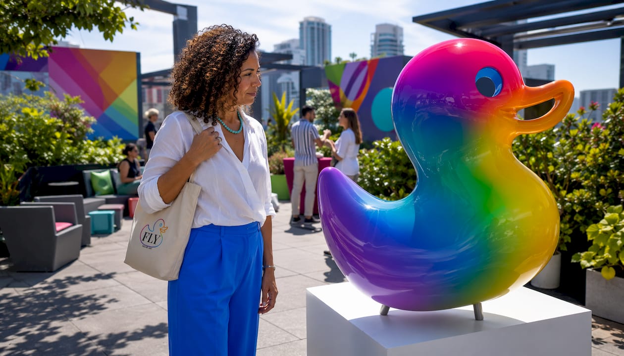
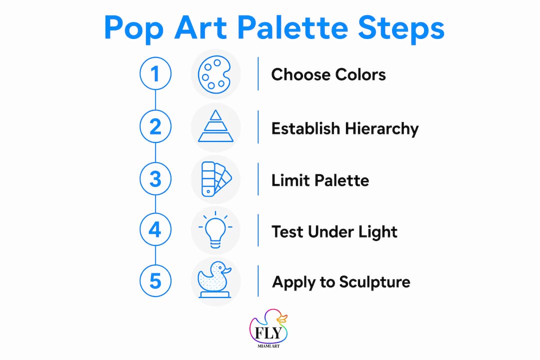
The fastest way to blend pop art bold color palettes for UV-reactive sculptures: pick two hero colors, add one shock accent, and buffer everything with black and white. Limit your dominant inks to three or four total. That constraint sounds tight, but it’s what keeps a piece readable under gallery lighting and electric under blacklight. Flymiami’s studio, led by award-winning artist Facundo Yebne, builds every commission around this exact hierarchy.
Three principles make or break the approach:
- Choose complementary pairs for maximum contrast. Yellow vs. purple, cyan vs. hot pink, orange vs. blue. These pairings create dynamic contrast that reads at a distance without needing explanation.
- Restrict your palette to a limited number of dominant colors plus black and white. More than that and high-saturation hues start competing rather than communicating.
- Test every palette in both daylight and blacklight before approving. UV-reactive pigments can shift perceived hue and luminance under blacklight, so what looks balanced in your studio may look completely different under a 365 nm lamp.
Pantone and CMYK references matter here too. When you commission a piece, giving your studio a Pantone number instead of a vague color name eliminates guesswork and keeps the final sculpture consistent with the approved swatch.
Table of Contents
- How do you blend pop art bold color palettes that actually work?
- How do you stop neon colors from visually vibrating?
- How does blacklight change color, and how do you plan for both viewing modes?
- What materials work best for UV-reactive pop-art sculptures?
- What’s the step-by-step workflow for approving a UV-reactive palette?
- Flymiami’s UV-reactive sculptures: where bold palettes meet studio craft
- Key Takeaways
- Why testing is the part most collectors underestimate
How do you blend pop art bold color palettes that actually work?
Strong pop-art palettes follow a clear hierarchy: two hero colors carry the composition, one shock accent punctuates key details, and black plus white do the structural work. Limiting the count to 3–4 colors ensures readability even at high saturation.
The most reliable starting point is complementary color theory. Colors opposite each other on the wheel produce the sharpest contrast with the least effort. Here are six proven palette recipes collectors and studios return to repeatedly:
| Palette Name | Hero Color 1 | Hero Color 2 | Accent | Neutral |
|---|---|---|---|---|
| Lichtenstein Primaries | Red | Yellow | Blue | Black/White |
| Warhol Neon | Hot Pink | Electric Cyan | Lime Green | Black |
| Retro Diner | Teal | Coral #FF6B6B | Cherry Red | Cream |
| Electric Fusion | Neon Orange | Violet | Shock Yellow | Charcoal |
| Fireworks | Magenta | Electric Blue | Gold | Black |
| Miami Sunset | Hot Coral | Turquoise | Bright Yellow | White |
Gradients have a narrow role in this format. A single short-range blend, say yellow shifting to orange across a small surface, adds depth without softening the silhouette. Keeping transitions minimal preserves the crisp shapes that make pop art legible at distance. The moment a gradient spans more than 20–30% of a surface, the graphic punch starts to dissolve.
Pro Tip: Pick two hero colors that differ in both hue and relative luminance, not just hue alone. A bright yellow and a deep purple separate instantly at a glance. A bright yellow and a bright orange require much more work to keep distinct, especially under UV light.
How do you stop neon colors from visually vibrating?
The answer isn’t choosing softer colors. It’s black outlines and shadow blocks used with discipline. When two high-saturation surfaces meet directly, the eye struggles to find an edge, and the result is visual vibration that causes fatigue. Black acts as a hard stop between competing frequencies.
Follow these steps in order:
- Outline every major shape in black before filling with color. Outline thickness should scale with sculpture size: 3–5 mm for small pieces, 8–12 mm for large-format works.
- Add shadow blocks on the darker side of each form. A flat black or deep charcoal block reads as a shadow and gives the eye a resting point.
- Insert a neutral buffer wherever two neon surfaces meet. A 3–6 mm strip of black, charcoal, or cream between adjacent fluorescent areas stops color vibration cold.
- Use white for highlights and breathing room. Small white zones near edges or centers create the illusion of light hitting the surface and prevent the composition from feeling airless.
- Check legibility at multiple viewing distances. At 3 feet, fine outlines matter. At 15 feet, only the broadest shapes and highest-contrast zones register.
For curating an immersive pop art show, the same rules apply at room scale: neutrals between installations, strong silhouettes, and consistent outline weight across pieces.
Pro Tip: When two neon surfaces must meet without a gap, use a thin black outline rather than a neutral strip. Even 2 mm of black reads as a boundary under blacklight when the surrounding colors are fluorescent.
How does blacklight change color, and how do you plan for both viewing modes?
UV-reactive pigments glow under blacklight and can shift perceived hue and luminance significantly. A cyan that reads as medium-bright in daylight may appear almost white under a 365 nm lamp. A deep violet may disappear entirely. Always test actual materials in both lighting conditions before committing to a palette.
Lighting specs to know before you test:
- Blacklight wavelength: Longwave UVA at approximately 365 nm is standard for gallery and event display. Shortwave UV (below 320 nm) is not used for art display and can damage materials.
- Daylight preview: Use a D65 daylight-equivalent light source for standardized color evaluation.
- Viewing distance: Test at both close range (3–5 feet) and across the room (12–15 feet).
Testing checklist, in order:
- Mount a swatch panel with all palette colors labeled by hex code and Pantone reference.
- Photograph the panel under D65 daylight with calibrated white balance.
- Switch to a 365 nm blacklight and photograph again with the same camera settings.
- Compare both sets of images on a calibrated monitor.
- Inspect the swatches with the naked eye in both conditions and note any hue shifts or contrast collapses.
Pro Tip: Prioritize two hero pigments that remain visually distinct under UVA. If they collapse toward the same apparent brightness under blacklight, the composition loses its hierarchy entirely. Subtle hue differences are not enough — you need luminance separation too.
What materials work best for UV-reactive pop-art sculptures?
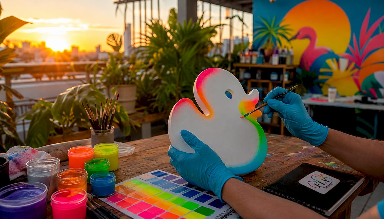
Use artist-grade acrylics or specialty UV-reactive pigments built for durability, pair them with archival clearcoats that don’t block fluorescence, and always request the MSDS before ordering. Here’s how the main pigment types compare:
| Pigment Type | Typical Media | UV Stability | Archival Notes | Safety |
|---|---|---|---|---|
| Fluorescent pigment | Acrylic, resin | Moderate; fades with UV exposure over time | Requires UV-filtering clearcoat for long-term display | Low toxicity; standard PPE |
| Neon pigment (dye-based) | Spray, acrylic | Lower; not recommended for outdoor display | Sensitive to light; store away from direct sun | Ventilation required for spray |
| Standard pigment + fluorescent additive | Acrylic, resin | Higher base stability; additive may fade | Test additive separately for lightfastness | Standard PPE |
| UV-reactive resin | Resin casting | High when fully cured | Excellent for sculptural forms; check ASTM ratings | Ventilation and gloves required during cure |
When sourcing materials in the US, contact specialty pigment distributors, archival acrylic brands, UV varnish manufacturers, and custom pigment labs. Ask each supplier for:
- Lightfastness rating (ASTM I or II preferred for long-term display)
- MSDS documentation
- Accelerated UV-aging test data if available
Safety notes worth taking seriously: spray and resin work requires proper ventilation and respiratory protection. For pieces intended for permanent collection display, request accelerated-lightfastness testing data from the pigment supplier before finalizing the palette.
What’s the step-by-step workflow for approving a UV-reactive palette?
Follow this sequence from first sketch to final sign-off:
- Palette selection. Choose 2 hero colors, 1 shock accent, and confirm black/white buffers. Reference hex codes and Pantone equivalents for every color.
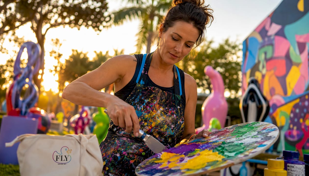
- Build a labeled swatch board. Include ink name, hex, Pantone, and pigment type for each color.
- Create a small-scale mockup. Even a 6-inch painted panel reveals proportion and contrast issues before you commit to full scale.
- Photograph under D65 and 365 nm blacklight. Use calibrated camera settings for both shots.
- Adjust ratios and outlines. If a color dominates too much or vibrates against a neighbor, correct it at this stage.
- Build the full-scale prototype.
- Run final lighting tests. Check daylight, blacklight, and mixed ambient conditions.
- Capture the photographic record. This becomes part of the commission documentation.
- Client and studio sign-off. Use a checklist covering contrast, glow intensity, legibility, and finish quality.
Typical timeline and cost drivers:
| Phase | Typical Duration | Primary Cost Driver |
|---|---|---|
| Palette consult + swatch board | 1–2 weeks | Specialty pigment sourcing |
| Small mockup | 1–2 weeks | Labor and material testing |
| Full-scale prototype | 3–6 weeks | Resin work, complex finishes |
| Dual-light testing + approval | 1 week | Photography and revision rounds |
| Final finish + shipping | 2–4 weeks | Finish complexity, crating |
Approval criteria to confirm before moving forward: contrast holds in both lighting modes, glow intensity meets the collector’s expectations, outlines read clearly at the intended viewing distance, and the surface finish is consistent across the entire piece.
Flymiami’s UV-reactive sculptures: where bold palettes meet studio craft
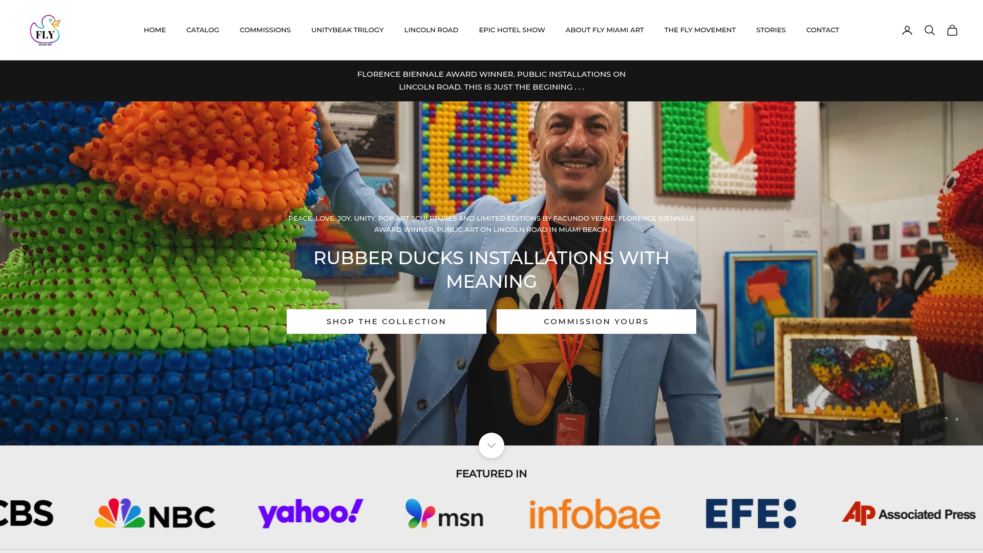
Flymiami, the studio behind Facundo Yebne’s award-winning UV-reactive pop-art sculptures, handles every stage of a commission: palette consulting, material selection, swatch testing, prototype build, dual-light approval, and final finish. The studio process is documented in detail for collectors who want to understand exactly what happens between concept and delivery.
What sets Flymiami apart from a standard art dealer is the dual-light testing built into every commission. You don’t receive a finished piece and hope it glows correctly. The palette is tested, photographed, and approved in both daylight and blacklight before the full-scale work begins. Pieces like the Smiley Black Glow and Glowing with Pride show exactly what that process produces: sculptures that hold their palette in normal light and transform completely under UV. Facundo Yebne’s work has been featured in prestigious exhibitions and recognized for its contribution to immersive, experience-driven pop art.
To begin a commission or request a palette consult, visit Flymiami’s UV glow art collection or browse the full sculpture range.
Key Takeaways
Blending bold pop-art color palettes for UV-reactive sculptures requires a strict palette hierarchy, disciplined contrast management, and mandatory dual-light testing before any full-scale work begins.
| Point | Details |
|---|---|
| Limit to 3–4 dominant colors | Use 2 hero colors plus 1 shock accent; black and white handle structure. |
| Use black outlines and neutral buffers | Insert a 3–6 mm neutral strip between adjacent neon surfaces to stop visual vibration. |
| Test in both lighting modes | Photograph swatches under D65 daylight and 365 nm blacklight before approving any palette. |
| Document with hex and Pantone references | Label every swatch with hex, Pantone, and pigment type for supplier and studio communication. |
| Commission through Flymiami | Facundo Yebne’s studio builds dual-light testing and prototype approval into every UV-reactive commission. |
Why testing is the part most collectors underestimate
Most collectors focus on the palette selection and trust that execution will follow. The part that actually determines whether a UV-reactive sculpture succeeds is the testing phase, and it’s the step most studios skip or compress.
A palette that looks balanced in daylight can lose its entire hierarchy under blacklight. A hero color that reads as dominant in normal light may flatten to the same apparent brightness as the accent under UVA, collapsing the composition’s logic. The only way to know is to test the actual pigments, on the actual substrate, under the actual light source you intend to use for display. Digital simulation helps, but it doesn’t replace physical swatches under a 365 nm lamp.
The UV-reactive works Flymiami produces go through this process without shortcuts. That’s not a marketing claim — it’s visible in the consistency of the finished pieces across both viewing modes. Collectors who care about how a sculpture performs in a gallery setting, a home with blacklight fixtures, or an event environment should ask any studio they’re considering: where are the swatch photographs, and what did the prototype look like under UV before the final piece was built?
If the answer is vague, that’s the real risk in the commission.