One Hero Piece: Pop Art Interior Design for Modern Homes
Pop art interior design uses bold graphics, saturated primary colors, and mass-culture imagery to turn a room into something closer to a comic panel than a showroom. The fastest way to get it right: pick one hero artwork, keep the walls and floor neutral around it, and let lighting and one repeated accent color do the rest of the work.
TL;DR:
- Art should be oversized relative to furniture, with a minimum width of 60% of the piece it is hung above to prevent visual shrinkage.
- Use one or two bright colors sampled directly from the hero artwork, and keep large surfaces neutral to balance saturated hues.
- Furniture must have simple, low-profile silhouettes in neutral fabrics to avoid competing with bold pop art pieces.
- Proper lighting, including wall-wash or angled spotlights, is crucial to highlight textures and prevent flatness, especially for textured or sculptural art.
- Limit supporting colors to two and ensure art is clearly the room’s focal point for a cohesive, intentional pop art interior.
Table of Contents
- What Is Pop Art Interior Design, Exactly?
- Five Pop Art Looks and When to Use Each
- What Makes an Interior Recognizably Pop Art?
- How to Choose Pop Art Color Schemes That Read Intentional
- Furniture and Materials That Let the Art Lead
- Getting the Scale, Placement, and Lighting Right
- Room-by-Room Pop Art Ideas That Won’t Overwhelm
- Common Mistakes and a Simple Balancing Checklist
- How a Pop Art Studio Actually Prepares a Piece for Your Home
- From Warhol’s Factory to Your Living Room Wall
- The Artists Whose Work Still Shapes Pop Art Rooms
- Mixing Pop Art With Other Design Styles
- Keeping Pop Art Pieces Looking Right for Years
- Designer-First Perspective on Choosing and Living With Pop Art
- Where to Find an Original or Commissioned Hero Piece
- Sources
What Is Pop Art Interior Design, Exactly?
The style traces back to England in the mid-1950s and hit its stride in America roughly a decade later, when artists started borrowing imagery straight from advertising, comic strips, and celebrity culture instead of inventing new subject matter. That origin still shapes the defining traits of pop art interiors today: gloss finishes next to matte plaster, plastic next to wood, a punchy graphic next to a plain sofa.
If you searched for “pop art interior design,” you probably already know the visual reference points: Warhol’s soup cans, Lichtenstein’s comic panels, a wall of neon. The industry term for the broader design language is Pop Art decor, and you’ll see it used interchangeably with “pop art style” in shelter magazines and gallery writeups. Both point to the same thing. What most guides skip is the practical part: how to size the art, where to put the lights, and which furniture choices quietly wreck the effect.
Five Pop Art Looks and When to Use Each
Not every pop art direction suits every room. Matching the look to the space matters more than picking the “coolest” one.
- Comic-graphic panels work best in home offices or dens where you want energy without visual overload. Bold outlines and flat color blocks in a smaller room read as punchy, not chaotic.
- Warhol-style repeated portraits suit long walls, hallways, or dining rooms where a grid of near-identical images creates rhythm as you walk past.
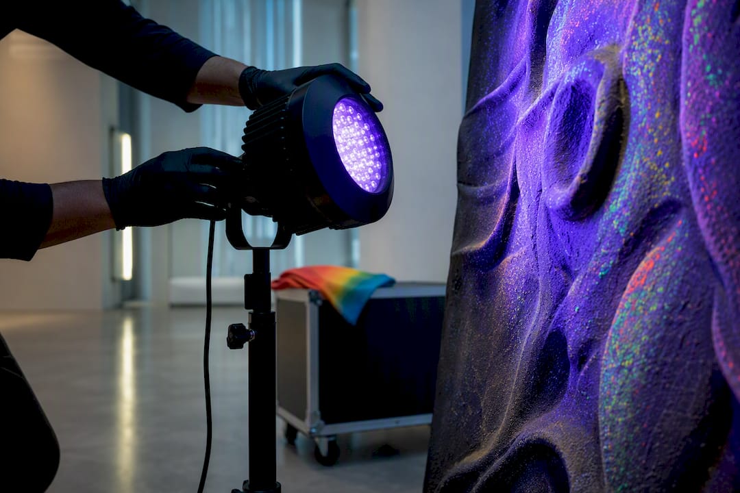
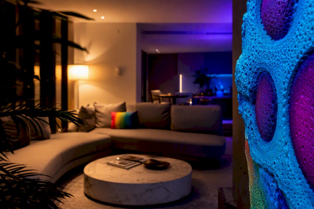
- Neon and UV-reactive pieces shine (literally) in lounges, home bars, or media rooms with dimmable lighting, since the glow effect needs low ambient light to register.
- Memphis-inspired geometrics fit playful, younger spaces like a kid’s room or a creative studio, pairing squiggles and confetti shapes with primary colors.
- Bold typography art reads well in kitchens and entries, where a short phrase or single word carries visual weight without competing for attention.
For sourcing, limited-edition prints are the accessible entry point, original works and commissions offer more control over scale and finish, and either route beats a generic mass-produced poster once you’ve seen how much finish quality changes a piece’s presence on a wall.
What Makes an Interior Recognizably Pop Art?
Five characteristics separate a genuine pop art room from a space that just happens to have bright walls. The palette leans on primary and neon colors rather than muted tones. Imagery draws from recognizable, often mass-media sources: portraits, retro advertising, cartoon figures. Graphic patterns, including stripes, polka dots, and the halftone dot pattern known as Ben-Day dots, show up in the art and sometimes in textiles. Materials mix deliberately, glossy lacquer or plastic set against something with real texture. And contrast stays high enough that the piece reads clearly from across the room, not just up close.
These traits work together the way panels in a comic book do: bold outlines, flat color, and instant readability combine into one clear visual statement instead of a blur of competing details.
Designers who work in this space consistently say the same thing: build the room around the artwork first, and let it dictate the palette, the proportions, and the rhythm of everything else. Treating the art as a final accessory, added after the sofa and rug are chosen, is how pop art rooms end up feeling disconnected.
How to Choose Pop Art Color Schemes That Read Intentional
The rooms that look curated instead of chaotic almost always follow the same basic color logic, even when the palette itself is loud.
- Start with a neutral base. White, gray, or warm beige walls and flooring give the eye somewhere to rest.
- Add one or two dominant bright colors pulled directly from your hero artwork. Repeat them in a throw pillow, a lamp base, or a single accent chair.
- Anchor the scheme with one dark, grounding tone, usually black or deep navy, in a frame, a table leg, or trim.
- Pick one dominant pattern and let it lead. If your art has polka dots, don’t add a striped rug. Match pattern scale to room size; small dots suit small rooms, chunkier graphics need more square footage to breathe.
Pro Tip: Photograph your hero piece and pull three exact hex colors from it before you shop for textiles. Matching swatches to a photo beats matching them to memory every time.
Furniture and Materials That Let the Art Lead
Furniture in a pop art room has one job: stay quiet enough that the art keeps the spotlight. Ornate carving, busy upholstery patterns, or heavily distressed wood finishes compete with graphic art instead of supporting it.
- Choose simple, low-profile silhouettes, mid-century-style sofas and chairs work particularly well because their clean lines echo the flat planes in pop graphics.
- Mix finishes deliberately: a glossy lacquer coffee table, one acrylic side chair, a velvet accent cushion, and a raw wood shelf can all sit in the same room if each material gets its own moment instead of competing for attention.
- Small sculptural side tables or a single statement lamp add personality without stealing focus from the wall.
- Keep large upholstered pieces (sofas, sectionals) in solid neutral fabric so they don’t fight the art’s palette.
Getting the Scale, Placement, and Lighting Right
Undersized art is the single most common reason a pop art room falls flat. A piece that looks bold in a gallery can shrink to nothing over a large sofa.
| Element | Guideline |
|---|---|
| Art width vs. furniture | At least 60% of the width of the furniture piece below it (sofa, console, headboard) |
| Hanging height | Center of the artwork at eye level, typically 60 inches from the floor |
| Standard lighting | Angled spotlight or picture light, 30 degrees off the wall, for flat prints with texture |
| Wall-wash lighting | Even, broad light across a gallery wall or multi-panel layout |
| UV-reactive or textured pieces | Dimmable ambient light plus a dedicated UV or blacklight source; install away from direct sun exposure |
Textured and sculptural pop art behaves differently than a flat print. Grazing or angled light reveals depth and relief that flat overhead lighting flattens out, so the same piece can look completely different at 2 p.m. versus after dark with a spotlight engaged.
Room-by-Room Pop Art Ideas That Won’t Overwhelm
Pop art works differently depending on the room’s function. A living room can absorb a lot more visual noise than a bedroom meant for winding down.
- Living room: One hero piece over the sofa or console, then repeat a single accent color from it in pillows or a rug. Resist adding a second large statement piece in the same sightline.
- Bedroom: Go softer. A smaller-scale graphic print or one boldly colored headboard wall gives you the style without fighting a restful mood.
- Kitchen and dining: Typographic art or a multi-panel print holds up well here, and finishes should be durable and wipeable since these rooms see grease and splashes.
- Entry and home office: One strong focal piece does double duty, setting the tone for guests at the door or boosting energy during a workday. Clear sightlines in entries and living areas make them the easiest rooms to place an oversized piece without it feeling cramped.
Common Mistakes and a Simple Balancing Checklist
Most failed pop art rooms share the same handful of problems: too many saturated colors fighting at once, low-quality prints with muddy color reproduction, art hung too small for the wall, and lighting that was never adjusted after the art went up. Cheap framing or poor print quality can make even a genuinely strong graphic look like a dorm-room poster.
There’s no standardized “3-5-7” design rule despite what some blogs claim. A simpler, more usable version is the 1-2-3 approach: one hero piece, two supporting colors pulled from it, and three large neutral surfaces (walls, floor, and one major furniture piece) that stay quiet.
Before you buy or hang anything, run through this:
- Does one piece clearly outrank the others as the visual anchor?
- Have you limited your bright accent colors to two, max?
- Are your largest surfaces (walls, floor, sofa) neutral?
- Is the art sized to at least 60% of the furniture width beneath it?
- Have you tested the lighting after dark, not just during the day?
How a Pop Art Studio Actually Prepares a Piece for Your Home
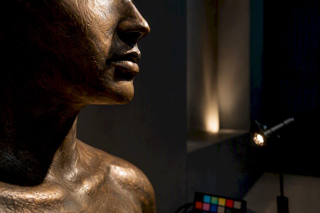
A serious studio process starts with concept and moves through material selection, scale mockups, and finish testing before a piece ever ships. That sequence matters more with UV-reactive or textured work, since a design that glows spectacularly under blacklight in a studio can fall flat in a room without a dedicated UV source.
- Confirm exact dimensions against your wall and furniture, not just the piece’s listed size.
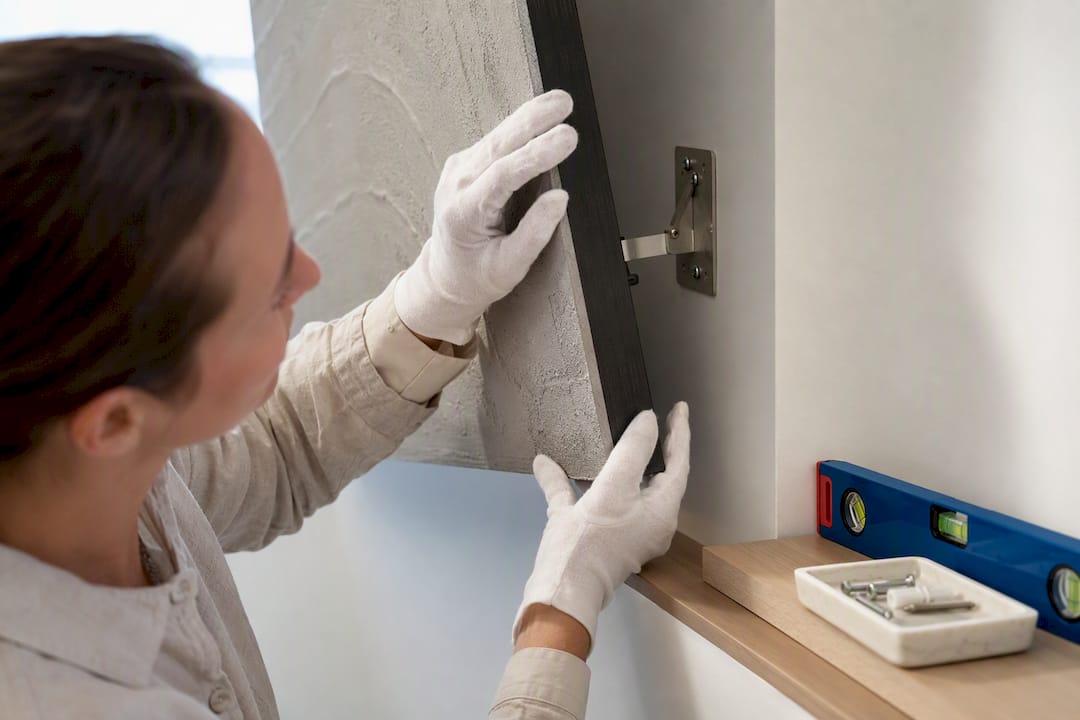
- Ask about mounting hardware and whether the wall needs reinforcement for heavier sculptural pieces.
- Clarify whether the finish is UV-reactive, textured, or flat gloss, since each demands different lighting.
- Ask about maintenance: cleaning method, sun exposure limits, and touch-up options over time.
Flymiami’s own studio process follows this concept-to-finish sequence, which is worth understanding before commissioning any custom or UV-reactive piece from any maker.
From Warhol’s Factory to Your Living Room Wall
Pop art started as a rebellion against the seriousness of abstract expressionism. Artists in the mid-1950s and 1960s looked at soup cans, comic strips, and Hollywood publicity photos and asked why “high art” couldn’t include them. That irreverence is exactly what makes the style so portable into homes today: it was always meant to be accessible, reproducible, and a little irreverent about its own value.
The jump from gallery movement to interior design trend happened gradually, with examples like Unveiled New York nightclub showcasing pop art-inspired interiors featuring immersive installations. Through the 1970s and 1980s, pop art’s visual language, flat color, bold outline, mass-media subject matter, started showing up in commercial interiors: diners, boutiques, record stores. By the 2000s, designers were pulling those same devices into residential spaces, pairing a single iconic print with mid-century furniture to create rooms that felt curated rather than kitschy.
What’s shifted more recently is material technology. UV-reactive pigments and blacklight-responsive finishes let a piece hold two identities: one under normal light, a completely different one under UV. That’s a genuinely new tool in the pop art toolkit, not available to the movement’s founders, and it’s changed what “statement piece” can mean in a modern living room or lounge.
The through-line across seven decades is consistency of intent: take something familiar, blow it up in scale, saturate the color, and force the viewer to look again. That’s as true of a Warhol repeat print from 1962 as it is of a UV sculpture switching on under blacklight in 2026.
The Artists Whose Work Still Shapes Pop Art Rooms
Andy Warhol remains the reference point most people picture first, thanks to the Campbell’s Soup Cans and the repeated celebrity portraits (Marilyn Monroe, Elvis) that turned mass production itself into the subject of the art. His influence on interiors shows up most in the repeated-grid layout, several near-identical prints hung in a tight row, which designers still use to fill long walls with rhythm instead of a single static image.
Roy Lichtenstein brought comic-strip aesthetics into fine art, with thick black outlines, flat primary colors, and the Ben-Day dot pattern borrowed from cheap newsprint printing. That dot pattern is now a shorthand for pop art itself; you’ll spot it on everything from throw pillows to wallpaper.
Keith Haring’s bold, cartoonish figures and thick outlines translate especially well into playful spaces, kids’ rooms, creative studios, gyms, because the shapes read clearly even from a distance and at small scale. Robert Indiana, best known for his stacked “LOVE” typography, showed how a single word rendered in bold color and clean type can function as a complete design statement on its own, which is exactly the logic behind typographic pop art in modern entries and kitchens.
None of these artists designed for domestic walls specifically. Their influence on interiors comes secondhand, through the visual grammar they established: flat color, mass-media subject matter, and graphic clarity that scales from a gallery to a living room without losing impact.
Mixing Pop Art With Other Design Styles
Pop art rarely works as the only aesthetic in a home, and it doesn’t need to. The style pairs well with several others precisely because its core moves, bold color, graphic clarity, high contrast, are simple enough to slot into an existing room without a full redesign.
Mid-century modern is the most natural pairing. Clean-lined furniture from that era shares pop art’s era and its taste for flat planes and simple geometry, so a Warhol-style print over a walnut credenza feels coherent rather than clashing.
Minimalism benefits from pop art in a different way: a stark white room with one loud graphic piece gets instant personality without sacrificing the calm the rest of the space provides. The key there is restraint everywhere except the art itself.
Industrial interiors, exposed brick, black metal, concrete, give pop art a rougher, more urban context that softens its glossiness. The contrast between raw material and slick graphic actually strengthens both.
The one combination to watch is maximalism. Piling pop art onto an already pattern-heavy, color-saturated room usually tips into visual noise rather than richness. If you’re working in a maximalist space, let the pop art piece be the loudest single element and dial back competing patterns nearby, rather than layering pattern on pattern on pattern.
Keeping Pop Art Pieces Looking Right for Years
Care requirements depend heavily on material. Standard framed prints need basic protection: keep them out of direct, prolonged sunlight to prevent fading, use a microfiber cloth for dust, and avoid glass cleaners with ammonia on any acrylic glazing since it can cloud over time.
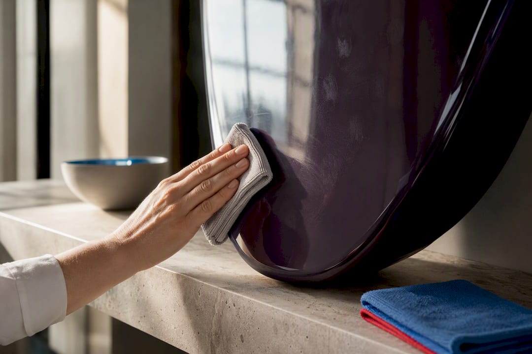
Glossy or lacquered surfaces, common in pop art furniture and some sculptural pieces, show fingerprints and dust more visibly than matte finishes. A quick wipe with a soft, slightly damp cloth handles most of it; avoid abrasive cleaners that can scratch the sheen.
UV-reactive and blacklight-responsive pieces have their own considerations. Excess humidity and direct sun exposure can degrade UV-reactive pigments faster than standard paint over time, so placement away from windows with heavy direct light matters more here than with a typical print. Dust gently and avoid harsh chemical cleaners on any UV-treated surface.
Textured or sculptural pieces need periodic inspection of mounting hardware, especially in humid climates where wall anchors can loosen. If a piece incorporates mixed materials (plastic, resin, mixed metals), ask the maker directly about cleaning methods rather than guessing, since what’s safe for one material can damage another on the same piece.
Designer-First Perspective on Choosing and Living With Pop Art
Most people over-shop when they start decorating with pop art. They buy three loud prints instead of one great one, then spend months trying to make them coexist. A better checklist: does this piece stop you for more than two seconds? Does it have a color you’re willing to repeat elsewhere in the room? Would it still hold up if everything else around it went quiet?
Rotate or refresh your display once a year, not because the old piece failed, but because a room’s energy shifts and art should shift with it. One curated major piece beats five small loud ones every time. The small ones compete with each other; the one great piece just gets to work.
— Facundo
Where to Find an Original or Commissioned Hero Piece
If you’ve read this far, you already know the hardest part of pop art interior design isn’t picking a color scheme, it’s finding one piece strong enough to build the whole room around. Some artists specialize in sculptural and wall-mounted work built to a scale and finish that is decided with your space in mind, sometimes including pieces with UV-reactive finishes that most print shops simply don’t offer.
Lead times vary by piece complexity, so it’s worth reaching out early if you’re planning around a renovation timeline or an event date. Installation notes, including mounting hardware and lighting recommendations for UV-reactive works, come with each commission conversation. Browse the wall art collection or explore the UV glow art pieces to see current available work and start a conversation about sizing your own hero piece.
Sources
For deeper detail on characteristics, lighting, and real project examples, see the Pop Art Interior Design Guide, The Punch’s feature on pop art interiors, and Architectural Digest’s Barcelona apartment feature.
- Pop Art Interior Design Guide: 9 Modern Home Decor Tips
- Pop Art interior design: a vibrant fusion of colour, iconography and everyday art — The Punch
- Pop Art Space Design Tips for Bold but Balanced Interiors — Acousart