Color in Pride Art Messaging: Meaning, History, and Design
Color in Pride art functions as a symbolic language — every stripe, chevron, and hue carries a specific claim about identity, political stance, and community belonging. That is not metaphor; it is design intent, built into the flags from the start.
Gilbert Baker made that explicit when he created the original Rainbow flag in 1978, assigning each of its eight colors a distinct meaning. Daniel Quasar pushed the logic further in 2019 with the Progress Pride flag, using structural placement — a hoist-side chevron rather than horizontal stripes — to signal which identities the broader movement had historically sidelined. The role of color in pride art messaging operates at three levels:
- Literal stripe meanings: each color names a value or identity (Baker’s red for life, violet for spirit)
- Structural messaging: where a color sits on the flag shapes its political weight (Quasar’s chevron foregrounds trans and POC identities rather than folding them into a universal rainbow)
- Broader artistic functions: visibility, subversion, local adaptation, and emotional tone-setting in gallery and public art contexts
Table of Contents
- How did Gilbert Baker’s original Rainbow flag assign color meanings?
- Why does the modern six-color flag differ from Baker’s original?
- What do the added colors in the Progress Pride flag represent?
- How does color function in Pride art beyond stripe meanings?
- Practical design guidance for artists and curators working with Pride colors
- Case studies: how specific color choices carried specific messages
- How FLY Miami Art applies color messaging through UV and blacklight techniques
- What do individual colors mean across different Pride flags?
- How do specific Pride flags compare across LGBTQ+ communities?
- How do cultural and regional contexts change Pride color meanings?
- What psychological and emotional effects do Pride colors have on audiences?
- How to combine colors for layered or intersectional identities in Pride art
- Key Takeaways
- Color, visibility, and the weight artists carry
- Flymiami’s Pride art collection: color with intention
- Useful sources and further reading
How did Gilbert Baker’s original Rainbow flag assign color meanings?
Gilbert Baker was a San Francisco artist and activist who designed the first Rainbow flag as a deliberate act of symbolic language. He wanted something alive — a “Rainbow of Humanity” that could be worn, flown, and felt rather than filed away as a corporate logo. The flag first flew publicly on June 25, 1978, at the Gay and Lesbian Freedom Day Parade in San Francisco, hand-sewn by Baker and a team of volunteers.
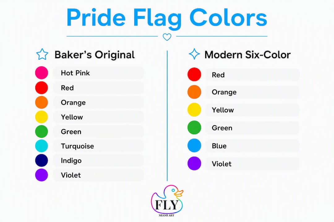
Baker’s eight-color original assigned meanings that mixed the elemental with the emotional:
| Color | Baker’s Assigned Meaning |
|---|---|
| Hot pink | Sex |
| Red | Life |
| Orange | Healing |
| Yellow | Sunlight |
| Green | Nature |
| Turquoise | Magic / Art |
| Indigo | Serenity |
| Violet | Spirit |
The flag was never meant to be a fixed academic system. Baker treated color as a living vocabulary — designed to accumulate meaning through use, not to be decoded like a cipher. That distinction matters for anyone reading or making Pride art today: the meanings are cultural agreements, not natural laws.
Why does the modern six-color flag differ from Baker’s original?
The shift from eight stripes to six came down to fabric and production reality, not ideology. Practical production constraints forced two changes: hot pink was dropped because the dye was commercially unavailable at scale, and turquoise and indigo were merged into royal blue to improve legibility when the flag was reproduced in mass quantities or viewed at a distance.
| Version | Colors | Key Change |
|---|---|---|
| Baker’s original (1978) | eight colors: hot pink, red, orange, yellow, green, turquoise, indigo, violet | First public version; handmade |
| Six-color standard (1979 onward) | Red, orange, yellow, green, blue, violet | Pink dropped; turquoise + indigo merged into blue |
| Progress Pride flag (2018) | Six-color base + black/brown + trans chevron | Chevron added at hoist |
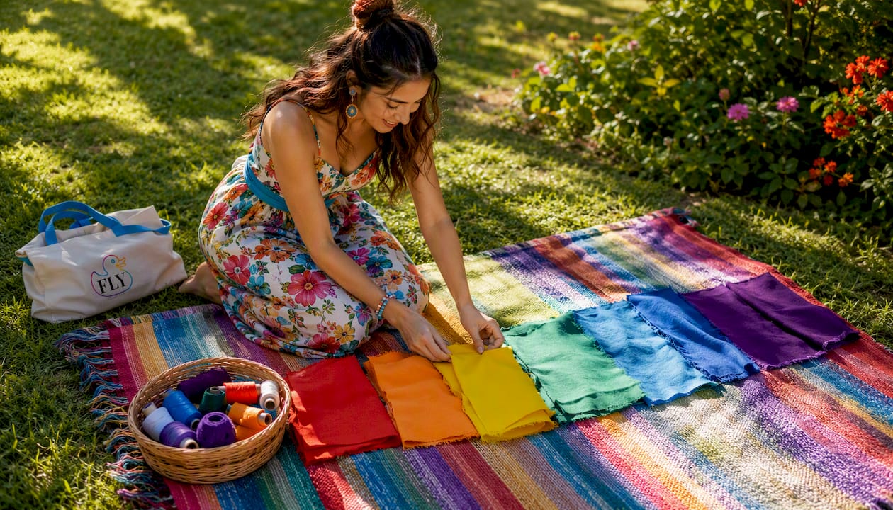
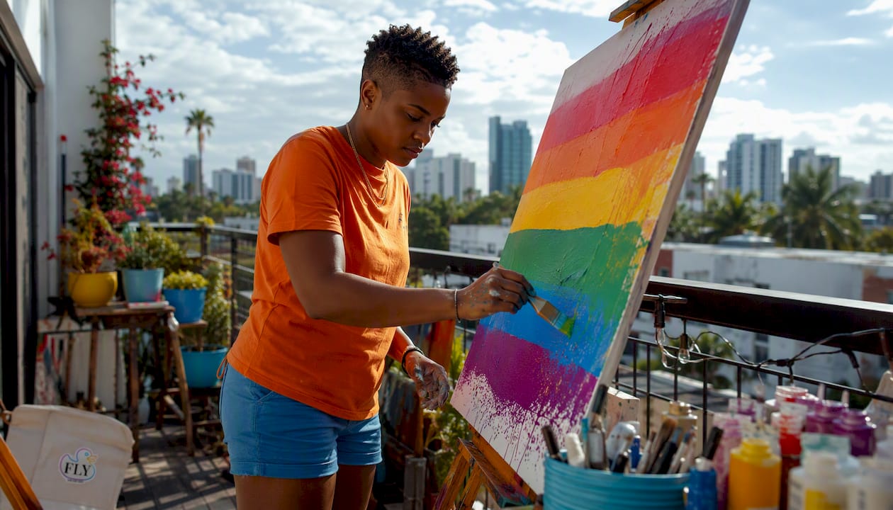
The Human Rights Campaign now summarizes the six-color version’s meanings as: red (life), orange (healing), yellow (sunlight), green (nature), blue (harmony), violet (spirit). “Hot pink” no longer appears in the flag itself, as it was part of Baker’s original eight-stripe version but was removed due to production constraints.
Collectors and institutions often track these production reasons as part of provenance. Knowing why pink disappeared — fabric availability, not erasure — changes how you read the flag’s history.
What do the added colors in the Progress Pride flag represent?
Daniel Quasar’s 2018 redesign did not simply add colors; it changed the flag’s grammar. The chevron shape at the hoist pulls the eye left, toward the identities it represents, rather than letting them dissolve into the horizontal flow of the rainbow. The Progress Pride flag adds black and brown stripes to represent People of Color and those lost to HIV/AIDS, and incorporates the trans flag’s pale blue, pink, and white to center transgender identity explicitly.
The V&A in London has documented this evolution as part of its design history holdings, treating the flag as an artifact of political design rather than mere decoration. That institutional recognition signals something: these color choices are now part of the formal record of 20th- and 21st-century visual culture.
The chevron placement was also a legibility decision. Quasar intentionally separated the identity-specific colors from the universal-values rainbow to avoid the implication that trans and POC identities were already fully included in the original message. Structure, not just hue, carries meaning.
How does color function in Pride art beyond stripe meanings?
The stripe glossary is the entry point, not the whole story. Color in queer visual culture has always done more than label identity; it codes, signals, subverts, and adapts.
Pro Tip: When reading Pride art, ask not just “what does this color mean?” but “why is it placed here, at this scale, under this light?” Placement and proportion shift meaning as much as hue does.
Lavender has carried sapphic and queer resonance since the early 20th century, appearing in poetry and coded correspondence long before any flag existed. LGBTQ symbols like the pink triangle and lavender demonstrate that color-coded queer signification predates the modern flag by decades. The rainbow itself was chosen partly because it already carried associations with peace and spectrum — Baker borrowed and redirected existing cultural weight.
Art criticism and recent exhibitions argue that color in queer visual culture can be simultaneously celebratory and confrontational. Some gallery-level works deliberately reject rainbow literalism, using monochrome or culturally specific palettes to challenge the assumption that one color system speaks for every queer experience. “Colourful blackness” — the practice of centering Black queer aesthetics within Pride visual language — is one example of how artists push back against a default palette that can erase as much as it celebrates.
Practical design guidance for artists and curators working with Pride colors
Using Pride-associated colors responsibly requires more than picking the right hex codes. Here is a working checklist:
- Identify your audience and context first. A flag for a community parade reads differently than a gallery installation or a hotel lobby commission. Scale, lighting, and viewer distance all affect legibility.
- Check color contrast for accessibility. Low-vision viewers need sufficient contrast between adjacent stripes or elements. Public sculpture accessibility standards apply to permanent installations and are worth consulting early in the design process.
- Respect the provenance of added colors. Black and brown stripes, trans colors, and other community-specific additions carry specific histories. Using them without understanding that history — or without consulting the communities they represent — risks tokenism.
- Account for production constraints. As Baker’s original flag showed, the gap between design intent and manufactured reality is real. Test your palette in the actual medium (print, fabric, UV-reactive pigment, digital display) before finalizing.
- Consider cultural specificity. Regional adaptations — such as South Asian queer designers integrating national color cues — show that the same color carries different political resonances across contexts. A palette that reads as Pride in one setting may read as national flag in another.
Pro Tip: When deciding between a chevron and integrated stripes, ask what relationship you want to show between identities. A chevron foregrounds; integrated stripes suggest equal standing. Neither is wrong — but they say different things.
For large-format or festival contexts, vibrant flag production at scale requires testing how colors read from 50 feet away, not just on screen.
Case studies: how specific color choices carried specific messages
- Baker’s handmade eight-color flag (1978): The volunteer production was itself a political act. A flag sewn by community members, not manufactured by a corporation, embodied the values it named. The hot pink stripe for “sex” was a deliberate refusal of shame — naming sexuality as a positive value in a public symbol was radical in 1978.
- The six-color standard (1979 onward): Losing pink and turquoise to production constraints did not dilute the flag’s power; it spread it. The simplified palette reproduced cleanly on everything from bumper stickers to building facades, turning the rainbow into one of the most recognized symbols in the world. The rainbow flag’s spread from San Francisco to global visibility happened partly because the six-color version was easy to make.
- Quasar’s Progress Pride flag and its reception: The Philadelphia city government adopted a version of the more-inclusive flag in 2017, adding black and brown stripes before Quasar’s full redesign. That municipal adoption signaled that color choices in Pride art had moved from community symbol to civic policy. QPOC artists and designers have since created further adaptations, layering local and intersectional identities into the chevron structure.
For collectors interested in rainbow art’s cultural meaning, provenance and production history carry as much weight as aesthetics.
How FLY Miami Art applies color messaging through UV and blacklight techniques
Facundo Yebne’s studio practice at Flymiami adds a dimension most Pride art does not address: what happens to color meaning when the light changes.
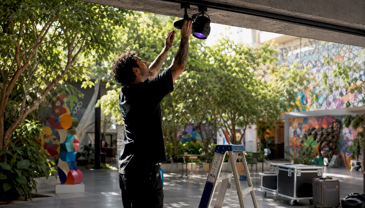
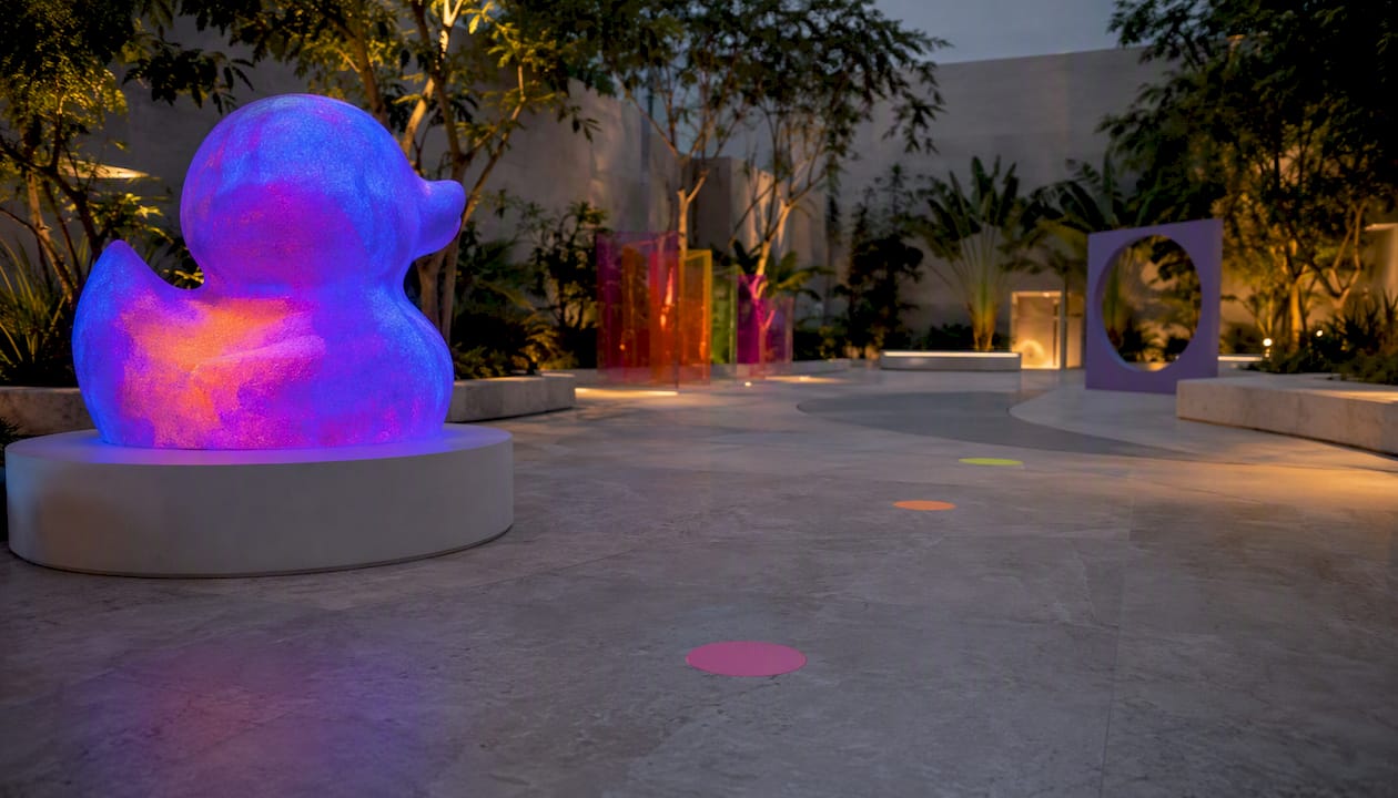
- Dual-state color messaging: UV-reactive pigments reveal hidden patterns and colors under blacklight that are invisible in daylight. A piece that reads as a standard rainbow palette in a gallery can transform into something entirely different at a festival or night venue — two messages in one object.
- Design for both states: Artists working with UV materials must design for daylight and blacklight viewing simultaneously. The UV-reactive rubber duck art practice at Flymiami treats this as a feature, not a complication — the shift in color perception under different lighting mirrors the way queer identity itself is context-dependent and multivalent.
- Conservation considerations: UV-reactive pigments behave differently from standard archival materials. Collectors and institutions acquiring these works should document both lighting states and consult the artist on long-term display conditions.
- Ethical provenance: Flymiami’s Pride-themed pieces, including works like Pink Proud Love, are designed with the symbolic weight of their color choices in mind — not as decoration, but as deliberate communication about identity and celebration.
What do individual colors mean across different Pride flags?
Color meanings in Pride symbolism are not fixed across flags — they shift by community and context. The six-color rainbow carries Baker’s original framework. The trans flag, designed by Monica Helms in 1999, uses pale blue for boys, pink for girls, and white for those transitioning, intersex, or non-binary. The bisexual flag (designed by Michael Page in 1998) uses pink for same-gender attraction, royal blue for different-gender attraction, and lavender where they overlap — a color that already carried queer resonance from its earlier history.
These are not arbitrary choices. Each designer worked within an existing vocabulary of color association and then extended or redirected it. The result is a layered system where the same blue can mean “harmony” in the rainbow flag, “male” in the trans flag, and “different-gender attraction” in the bisexual flag — depending entirely on context.
How do specific Pride flags compare across LGBTQ+ communities?
| Flag | Designer / Year | Key Colors | Core Meaning |
|---|---|---|---|
| Rainbow (six-color) | Gilbert Baker, 1978/1979 | Red, orange, yellow, green, blue, violet | Diversity, spectrum of humanity |
| Transgender | Monica Helms, 1999 | Pale blue, pink, white | Gender identity spectrum |
| Bisexual | Michael Page, 1998 | Pink, lavender, royal blue | Attraction across genders |
| Non-binary | Kye Rowan | Yellow, white, purple, black | Identities outside the binary |
| Progress Pride | Daniel Quasar, 2018 | Rainbow + black/brown + trans chevron | Intersectionality, forward movement |
Each flag is a design argument. The non-binary flag’s yellow represents identities outside the gender binary entirely — a color with no prior gender association, chosen precisely because it was neutral. That kind of deliberate selection is what separates symbolic color use from decorative color use.
How do cultural and regional contexts change Pride color meanings?
The rainbow reads as Pride almost universally in Western contexts, but that universality breaks down quickly elsewhere. South Asian queer designers working on regional flag proposals have documented how saffron orange, a color with deep Hindu nationalist associations in India, creates an unavoidable political collision when it appears in a Pride palette. The solution is not to avoid orange but to understand what it carries locally and design accordingly.
Regional deep-knowledge research shows that the Chennai Social Justice flag and other Indian adaptations deliberately incorporate local color systems alongside Pride motifs, communicating both queer identity and local political solidarity simultaneously. That layering is only possible when the designer knows both vocabularies.
In the United States, the rainbow’s cultural saturation means it can also be co-opted commercially, which is why some artists deliberately step away from it — using monochrome, earth tones, or culturally specific palettes to signal a more specific or critical stance.
What psychological and emotional effects do Pride colors have on audiences?
Color psychology research consistently shows that warm colors (red, orange, yellow) activate arousal and energy, while cool colors (blue, violet) tend toward calm and contemplation. The rainbow flag’s full-spectrum design was not accidental — Baker wanted a symbol that felt alive and encompassing, not restful or institutional.
For audiences who grew up seeing the rainbow as a hostile or forbidden symbol, encountering it in public carries a specific emotional charge: recognition, relief, and visibility in a single glance. That is the safety-signal function of Pride color. A rainbow sticker in a therapist’s window, a blue/pink/white flag outside a school — these are not decorations. They are statements about who is welcome.
The emotional impact also works negatively. Seeing Pride colors used carelessly — in a corporate campaign with no community investment, or in art that borrows the palette without the politics — produces a specific kind of alienation. Color meaning depends on context and credibility, not just hue.
How to combine colors for layered or intersectional identities in Pride art
The most effective intersectional Pride art does not stack every community’s flag colors into one image. It makes deliberate choices about hierarchy, relationship, and emphasis.
Start with the identity or message you want to foreground, then ask which color system best carries it. If you are making work about Black trans experience, the black and brown stripes of the Progress Pride flag and the trans flag’s pale blue and pink are your primary vocabulary — the rainbow is context, not the center. Placement reinforces this: foreground colors read as primary claims; background colors read as context.
Contrast and proportion matter as much as hue selection. A thin lavender stripe reads as a reference; a dominant lavender field reads as a statement. UV-reactive glow art adds another layer: colors that are secondary in daylight can become primary under blacklight, allowing artists to build works where the intersectional message is literally revealed rather than immediately visible.
The goal is not comprehensiveness — you cannot fit every community’s flag into one artwork without producing visual noise. The goal is intentionality: every color present for a reason, every color absent for a reason.
Key Takeaways
Color in Pride art is a deliberate symbolic language built on historical decisions, production realities, and ongoing community negotiation — not a decorative choice.
| Point | Details |
|---|---|
| Color as symbolic language | Every Pride color carries assigned meaning; Baker’s 1978 design established this as intentional political communication. |
| Flag evolution was practical | Pink and turquoise were removed from the six-color standard due to fabric availability and legibility, not ideological change. |
| Structure shapes meaning | Quasar’s Progress Pride chevron foregrounds marginalized identities through placement, not just color addition. |
| Cultural context is non-negotiable | The same color carries different political weight across regions; consult community before applying Pride palettes in new cultural settings. |
| Flymiami’s UV practice | Flymiami’s blacklight-reactive works add a dual-state color dimension, where meaning shifts between daylight and UV light — a direct application of layered Pride color messaging. |
Color, visibility, and the weight artists carry
The conversation around Pride colors tends to flatten into a stripe glossary — red means life, blue means harmony, done. But anyone who has spent time with queer public art knows that is not how it works in practice.
What strikes me most about Baker’s original design is not the color assignments themselves but the decision to make the flag handmade. The volunteer production was the first layer of meaning. The colors were the second. That sequence matters: the community made it before the colors meant anything, and the making is what gave the colors their weight.
The same logic applies to contemporary artists working with Pride palettes. The question is not just “which colors?” but “who made this, for whom, and with what understanding of what these colors have meant to the people who flew them under difficult circumstances?” That is a higher bar than color theory. It is the bar that separates decoration from communication.
Artists and collectors who engage with these symbols responsibly — centering the communities whose histories live in the colors, not just the aesthetics — are the ones producing work that will still carry meaning in twenty years.
Flymiami’s Pride art collection: color with intention
Flymiami’s Pride collection applies the design principles described throughout this article in a specific and unusual way: UV-reactive pigments that shift color under blacklight, turning a single sculpture into two distinct color statements depending on the light.
Works like Glowing with Pride use the rainbow palette as a starting point, then layer hidden color messaging that only emerges under UV light — a formal parallel to the way queer identity itself is often context-dependent and selectively visible. Every piece is handcrafted by Facundo Yebne, with color choices made deliberately rather than decoratively.
Collectors and gallery curators looking for Pride-themed wall art or original sculptures that go beyond surface-level rainbow application can browse the full collection or inquire about custom commissions directly at flymiami.art.
Useful sources and further reading
These primary sources and institutional references are worth consulting directly when using Pride flag imagery in publication, exhibition, or commissioned work:
- V&A: The Progress Pride Flag — The Victoria and Albert Museum’s documentation of Quasar’s design, its structural rationale, and its place in design history.
- Smarthistory: Art, Pride, and the Rainbow Flag — Scholarly art-historical overview of the flag’s origins, production history, and cultural spread.
- HRC: LGBTQ+ Pride Flags — The Human Rights Campaign’s reference guide to contemporary flag meanings across multiple communities.
When reproducing flag imagery in an exhibition or publication, consult artist statements and museum archives for provenance — the production history of these symbols is part of their meaning.