Immersive Exhibition Design Best Practices: A Practical Checklist
Effective immersive exhibition design rests on six non-negotiable priorities: comfort first, clear measurable goals, obvious affordances, layered content, accessibility built in from day one, and a structured evaluation cycle. Here is the short checklist to carry into every planning meeting:
- Define one measurable visitor outcome before choosing any technology
- Design the entry so the first action is obvious within three seconds
- Make every interaction visible and reward the first touch quickly
- Keep labels short, chunk text into panels of 50 words or fewer
- Build accessibility paths into prototypes and test with representative users
- Mitigate motion sickness and photosensitivity risk at the spec stage
- Plan for maintenance: spare parts, remote monitoring, and rollback procedures
- Run formative tests with 5–20 users before committing to full buildout
The Apple Human Interface Guidelines, the XR Association Developer’s Guide, and Flymiami’s UV-reactive installation work by Facundo Yebne all point to the same conclusion: the most memorable immersive experiences are the ones that never make visitors feel lost, uncomfortable, or excluded.
Key Takeaways
Comfort, clear goals, and early testing are the three pillars every immersive exhibition design project must build on before any technology decision is made.
| Point | Details |
|---|---|
| Comfort and safety first | Address VIMS, photosensitivity, and ergonomics at the spec stage, not during installation. |
| One measurable outcome | Define what visitors should say, feel, or do before choosing any technology or interaction model. |
| First touch is decisive | Provide immediate, unmistakable feedback to the first interaction; visitors who see no response rarely try again. |
| Accessibility from day one | Build captions, reach zones, and low-sensory modes into the first prototype, not the final review. |
| Test with 5–10 users early | Formative testing with a small representative group surfaces friction faster than large late-stage reviews. |
| Flymiami UV-reactive works | Flymiami’s blacklight sculptures provide a built-in attractor loop and reveal moment for immersive rooms. |
Table of Contents
- What are the best practices for immersive exhibition design?
- How do you attract visitors and orient them quickly?
- What makes interaction design work in immersive exhibits?
- How should you write labels and layer content?
- How do you make an immersive exhibition accessible to everyone?
- How do you manage safety and comfort in immersive experiences?
- What audio and lighting choices increase presence without causing fatigue?
- When should you use XR, VR, or AR in an exhibition?
- How do you prototype and evaluate an immersive exhibition?
- How do you keep an immersive installation running reliably?
- Applying the checklist: a UV-reactive sculpture installation by Flymiami
- The mindset that actually makes immersive exhibitions work
- Flymiami’s UV-reactive works for your immersive space
- Sources
What are the best practices for immersive exhibition design?
Start with one sentence: What should a visitor be able to say, feel, or do when they leave? That single outcome drives every downstream decision, from technology choice to floor plan.
Audience mapping comes next. Identify your primary cohort (the visitor you are designing for), secondary cohorts (families, school groups, accessibility users), and throughput constraints. A gallery expecting 200 visitors per hour needs different interaction models than one hosting 20 people in a contemplative space.
Constraints to define before committing to immersive tech:
- Target dwell time per zone (2 minutes vs. 10 minutes changes everything)
- Approach rate, engagement rate, and completion rate as success metrics
- Uptime requirements and acceptable maintenance windows
- Budget for spare hardware and content refresh cycles
The InformalScience/VSA literature review synthesizes decades of museum exhibit research into a consistent finding: exhibits with clear, pre-defined goals outperform those designed around technology for its own sake. Teams that use collaborative, multidisciplinary design processes rather than ad-hoc trial-and-error consistently achieve better visitor outcomes.
Pro Tip: Link your single clearest outcome directly to the primary interactive affordance. If visitors are supposed to feel wonder, the first touchpoint must deliver wonder, not a tutorial.
Before committing to immersive tech, ask:
- Does this technology serve the outcome, or does it distract from it?
- Can a visitor with no prior context understand what to do in three seconds?
- What happens when the technology fails mid-show?
How do you attract visitors and orient them quickly?
The entry is a promise. If it does not invite approach and make the first action obvious within three seconds, a significant share of visitors will walk past. Immersive rooms research confirms that the three-second rule and first-touch principle are decisive: engagement falls sharply when an exhibit fails to reward within seconds.
Effective entry tools include idle/attractor animations that loop when no one is interacting, a concise title (five words or fewer) positioned at eye level, and spatial cues such as a lit threshold or a directional sound cue that pulls visitors in. For family audiences, motion and color contrast work fastest. For contemplative audiences, a quieter visual hook with a single evocative question tends to hold attention longer.
Layering works like this: the primary hook is visible from five feet away and requires no reading. Secondary options, deeper context panels, and audio tracks reveal themselves only after the visitor has engaged. Never front-load all content at the entry. For practical display and sightline advice, how to display large-scale art installations offers useful spatial guidance.
| Entry element | Family audience | Contemplative audience |
|---|---|---|
| Primary hook | Motion, bright color, sound burst | Single evocative image or question |
| Title length | 3–5 words, large type | 5–8 words, quieter typography |
| Attractor loop | 10 second animation cycle | Slow ambient shift, no audio |
| Secondary layer | Revealed on touch | Revealed after 30 seconds of dwell |
What makes interaction design work in immersive exhibits?
The first touch is sacred. Provide immediate feedback quickly and make cause-and-effect unmistakable. Visitors who do not see a response to their first action rarely try again.
Affordances need to be implicit, not instructed. Large press targets, proximity-based attractors, and controls placed within roughly 10 inches of a natural hand position reduce the need for written instructions. The Exploratorium’s research on multiple interactive features is direct: when several features compete for attention at equal salience, visitors feel overwhelmed and disengage. Build a hierarchy. One primary phenomenon, one or two secondary interactions surfaced after engagement.
For group and social use, design for spectatorship. Not every visitor will touch the exhibit; many will watch. Give spectators a clear sightline and a reason to stay. For accessibility, offer alternatives to touch: gesture recognition, floor projection, or motion-based inputs. Place controls at multiple heights to serve both standing adults and wheelchair users.
Pro Tip: Test your affordances with someone who has never seen the exhibit. If they hesitate for more than three seconds before touching anything, the cue is not strong enough.
How should you write labels and layer content?
Short is almost always right. A micro-explainer label runs 30–50 words. Longer copy gets chunked into 50-word panels with clear visual breaks between them. Instructions belong proximal to the control they describe, not on a separate panel across the room.
Layering strategy: primary hook copy is visible at a glance and creates curiosity. Optional secondary panels sit one step deeper, available to visitors who want more. Audio tracks and on-demand video provide the deepest layer for those who seek it. This structure respects the visitor who has two minutes and the one who has twenty.
Accessibility in content includes providing captions for all audio, audio description tracks for visual content, and alternatives for non-readers such as icons, tactile cues, or spoken prompts. The VSA interactive exhibit guidelines consistently recommend minimizing instructions and letting the design communicate the interaction.
How do you make an immersive exhibition accessible to everyone?
Accessibility is not a compliance checkbox. It is a core design constraint that, when addressed early, tends to improve the experience for every visitor.
A working accessibility checklist:
- Captions on all audio and video content
- Audio description tracks for visual-only elements
- Color contrast ratio meeting commonly accepted accessibility standards (minimum 4.5:1 for text).
- Controls reachable from a seated position (maximum 48 inches from floor)
- Tactile maps or physical models for spatial orientation
- Low-sensory mode option (reduced audio, dimmed lighting, slower animations)
- Captioned controls with icon alternatives for non-readers
The XR Association Developer’s Guide dedicates full chapters to accessibility and inclusive design. For sculpture and public art, ADA accessibility standards for public sculptures provides reach-zone and placement guidance specific to three-dimensional works.
Pro Tip: Build accessibility paths into your first physical prototype and test with at least one wheelchair user and one low-vision visitor before finalizing the layout.
How do you manage safety and comfort in immersive experiences?
Physical safety and sensory comfort protect visitors and limit liability. Address both at the specification stage, not during installation.
- Provide seating or rest zones within every immersive space longer than five minutes
- Round all exposed edges on physical structures
- Set maximum session lengths and communicate them clearly at entry
- Install quick-exit affordances (visible exits, pause buttons, staff call points)
- Follow Meta Quest best-practices guidance on photosensitivity: avoid flashing content that exceeds three flashes per second, and reference ISO 9241-391:2016 for threshold values
- For VR components, design predictable motion, maintain stable frame rates, and offer passthrough or grounded modes per Apple HIG recommendations
- Schedule break points into experiences longer than 20 minutes
Visually induced motion sickness (VIMS) is a real risk in any experience with simulated movement. Android XR guidance recommends predictable motion and configurable input settings as baseline mitigations.
Photosensitive content guidelines set the threshold at three flashes per second. Any content exceeding that rate requires a warning at entry and a bypass option.
What audio and lighting choices increase presence without causing fatigue?
Spatial audio and purposeful lighting are not finishing touches. They are structural decisions that shape how visitors perceive and move through a space. Design them at the same time as the floor plan.
- Layer audio into three tiers: ambient (fills the space), focused (tied to specific zones or objects), and functional (feedback sounds for interactions)
- Keep ambient volume low enough that visitors can speak comfortably; fatigue sets in faster than most designers expect
- Use contrast and spotlighting to direct attention rather than flooding the entire space with equal brightness
- Avoid full-field brightness spikes, which cause eye strain and break immersion
- For UV/blacklight installations, calibrate blacklight intensity to safe human-exposure levels and use materials tested for long-duration viewing; stage photography-friendly sightlines while managing glare
- Audio can mask environmental noise from HVAC or adjacent galleries, but only when the mix is intentional
For deeper guidance on ambient lighting and interaction, ambient lighting art interaction explained covers both technical calibration and aesthetic choices. Intel’s VR guidelines highlight spatialized sound and audio consistency as foundational to comfortable immersive experiences.
When should you use XR, VR, or AR in an exhibition?
Reserve full VR immersion for moments that genuinely require it. For everything else, favor blended or passthrough modes and give visitors control over their immersion level. This is the consistent recommendation across every major platform guide.
Platform HIG summaries:
- Apple HIG: Reserve full immersion for specific, high-impact moments; offer grounded and passthrough options to reduce sensory overload
- Android XR: Design for device diversity (seated, standing, reclined); use predictable motion and platform UI patterns for consistency
- Meta Quest: Prevent VIMS through stable frame rates and predictable motion; take photosensitivity seriously; build in breaks
- XRA Developer’s Guide: Follow evolving accessibility and inclusive-design standards; use domain-specific guidance for education and public-facing contexts
Latency under approximately 50–100 ms is the threshold for perceived responsiveness in interactive rooms, per immersive room research. Below that threshold, interactions feel live. Above it, they feel broken.
| Device class | FOV | Occlusion | Primary inputs | Mobility |
|---|---|---|---|---|
| XR headsets | Wide (about 90 degrees) | Full | Controllers, hand tracking | Tethered or standalone |
| XR glasses | Narrow (30°–50°) | Partial | Voice, touch, gaze | High |
| Projection rooms | Room-scale | None | Touch, gesture, floor sensors | Fixed installation |
How do you prototype and evaluate an immersive exhibition?
Test early and test small. Five to ten representative users in a formative session will surface more friction than a large late-stage review, per Helen Yentus’s VR exhibition guidance.
- Front-end research: Interview target visitors; identify mental models and prior knowledge gaps
- Low-fi prototypes: Cardboard mockups, role-playing walkthroughs, or VR pre-visualizations of the floor plan
- Formative testing: 5–10 users, observe approach rate, first-touch success, and completion rate; note verbal friction points
- Pilot: Run with 20–50 visitors; collect dwell-time data, sensor telemetry, and short exit surveys
- Summative evaluation: Post-opening data collection measuring learning outcomes, emotional response, and return intent
Map the experience as three beats: orientation (what is this and what do I do?), exploration (the core interaction), and reflection (what did I take away?). Give each beat one obvious action and one optional curiosity. Data to collect: video observation, heatmaps, sensor telemetry, and brief surveys. Use each formative round to fix one friction point before adding features.
How do you keep an immersive installation running reliably?
Design for maintainability from the first specification document. Durable finishes, modular hardware, and a spares strategy are the difference between an exhibit that runs for two years and one that becomes an expensive repair project after six months.
Maintenance checklist:
- Stock spare projector lamps, sensor units, and media players before opening day
- Schedule sensor-cleaning cycles (depth cameras and LIDAR accumulate dust quickly)
- Maintain a software rollback plan with a tested restore point
- Set up remote monitoring and automatic restart scripts for media servers
- Build a content-refresh pipeline so the experience can be updated without a full reinstall
- Train staff on simple reboot procedures and clear escalation steps for hardware faults
- Build friendly fallback animations for technical faults so visitors see a branded “we’ll be right back” screen rather than a crash
For pop-up and touring installations, design for flat-pack shipping: modular panels, labeled cable bundles, and a setup checklist that a two-person crew can execute in under four hours. Permanent installs can tolerate more complexity, but the monitoring and spares logic applies equally. Interactive civic art installation examples illustrate how modular design supports both touring and permanent contexts.
Applying the checklist: a UV-reactive sculpture installation by Flymiami
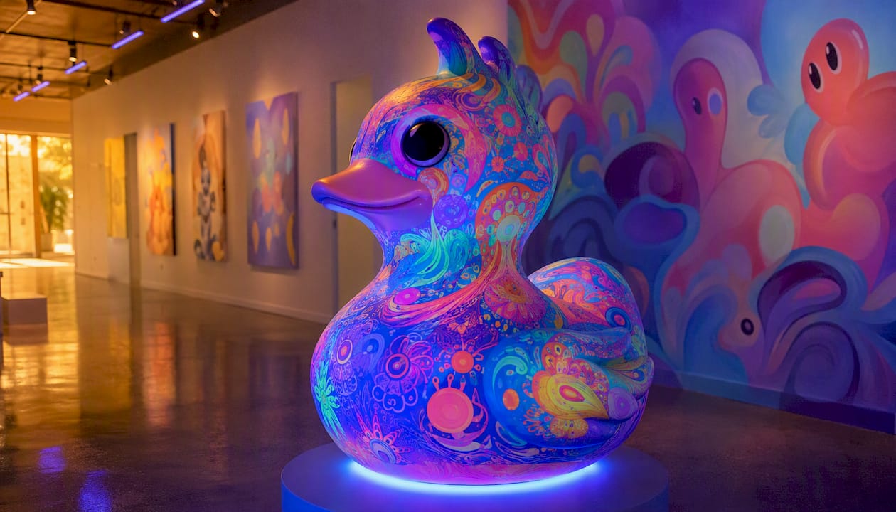
Flymiami’s UV-reactive sculpture work by Facundo Yebne offers a concrete example of these principles applied together. The studio’s installations use blacklight-calibrated environments where hidden patterns and colors emerge under UV light, creating a reveal moment that functions as the primary attractor loop. Visitors approach because the environment looks different from outside the space; they stay because each sculpture rewards closer inspection with new visual information.
Key practices the studio applies:
- UV-safe materials tested for long-duration human exposure, with blacklight intensity calibrated to avoid eye strain
- Attractor loops built into the lighting: the space shifts subtly when no visitor is present, drawing approach
- Staging designed for photography, with clear sightlines and controlled glare so visitors can share images without degrading the experience for others
- Layered content: the visual reveal is the primary hook; artist statements and material notes are available as secondary panels for visitors who want depth
- Accessibility considerations include clear pathways for wheelchair users and sufficient ambient light outside the UV zones for safe navigation
The Flymiami installations portfolio shows how these choices translate across hotel lobbies, gallery spaces, and public venues. For curators evaluating how to curate an immersive pop art show, the studio’s approach to layering and attractor design offers a replicable model.
The mindset that actually makes immersive exhibitions work
Most designers I know spend the first half of a project adding features and the second half removing them. The checklist above is an attempt to short-circuit that cycle: start with one clear outcome, earn the visitor’s attention before asking for their time, and prototype before you build.
Comfort and accessibility are not constraints that limit creativity. They are the conditions under which creativity actually reaches people. An exhibit that makes a visitor feel disoriented, excluded, or physically uncomfortable has failed regardless of how impressive the technology is.
Start small. A single well-calibrated interaction that rewards the first touch will outperform a complex multi-feature installation that confuses visitors in the first thirty seconds. Plan for the crowd, not the ideal visitor. And test with real people early, because your assumptions about what is obvious are almost always wrong.
Flymiami’s UV-reactive works for your immersive space
Flymiami’s UV glow art collection and sculptural commissions are built specifically for the kind of layered, reveal-driven immersive environments this checklist describes. Each piece by Facundo Yebne uses UV-reactive materials calibrated for gallery and public-space exposure, with hidden patterns that emerge under blacklight to create the attractor moment your entry needs. The statement pieces collection includes large-scale works designed as centerpiece elements for immersive rooms. Whether you are outfitting a hotel lobby, a gallery installation, or a touring pop-up, contact the studio with your brief and site dimensions to discuss a commission tailored to your space.
Sources
- Human Interface Guidelines — Immersive Experiences (Apple)
- XR Association presents the developers’ guide suite — XRA
- Overview of immersive VR apps best practices (Meta Quest)
- Designing science museum exhibits with multiple interactive features: five common pitfalls (Exploratorium)
- Immersive rooms for museums and exhibitions: what works (Mirror Experience)
- Developing experiences: creative process behind the design and production of immersive exhibitions (Springer chapter)