
What Makes a Sculpture Exhibition Engaging
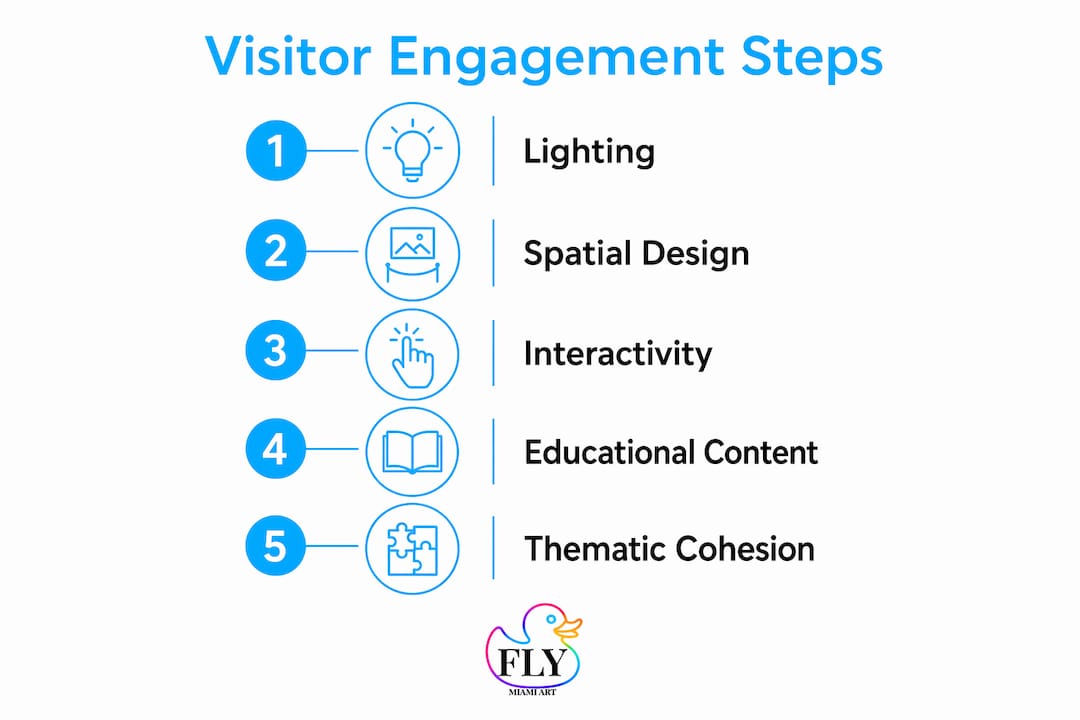
The most engaging sculpture exhibitions share five core qualities: deliberate lighting, spatial flow that guides without constraining, genuine interactivity, educational materials that add context without lecturing, and a unifying theme that makes the whole feel intentional. Get all five working together and visitors stop glancing at their phones. Miss even one and the experience feels flat, no matter how strong the individual works are.
Here is what each element actually requires in practice:
- Lighting that sculpts space and mood, not just illuminates objects
- Spatial layout that creates discovery rather than a march from point A to point B
- Interactive elements that invite touch, movement, or digital participation
- Educational content that answers “why does this matter?” without being condescending
- Thematic cohesion that ties every curatorial decision to a central idea
These are not independent checkboxes. A powerful interactive element placed in a poorly lit corner loses most of its impact. A beautifully lit gallery with no interpretive context leaves curious visitors guessing. The sections below break each element down into what actually works.
1. How lighting and spatial design shape visitor engagement
Lighting is the single fastest way to change how a sculpture feels. Directional spotlights carve out shadow and volume, making a piece look three-dimensional rather than flat. Ambient wash lighting, by contrast, flattens form and kills the drama that draws visitors in. The practical rule: use directional light as your primary source, then layer ambient light to soften harsh transitions between zones.
Color temperature matters more than most organizers realize. Warm light (around 2700K–3000K) reads as intimate and inviting, which works well for figurative or emotionally resonant work. Cooler light (4000K and above) feels clinical, better suited to conceptual or industrial pieces. Mixing temperatures within a single gallery without intention creates visual noise.
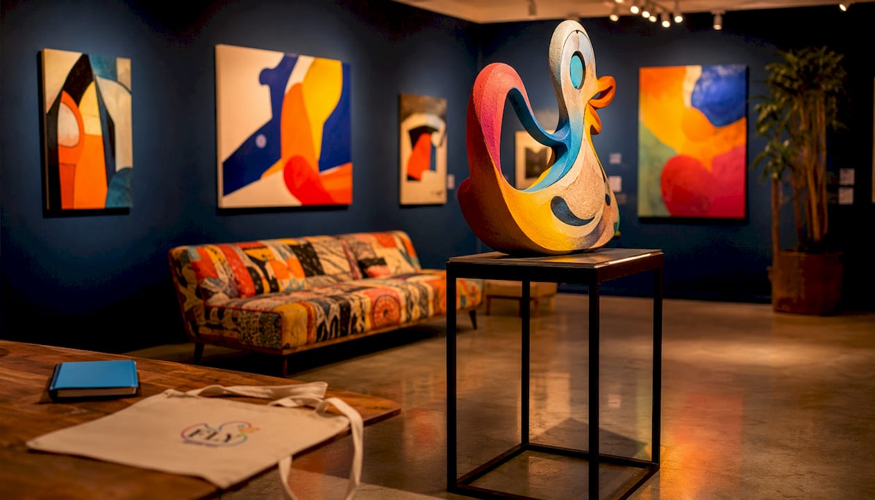
Natural light is a wildcard. Skylights and windows shift throughout the day, which can be spectacular or disruptive depending on the work. If your venue has significant natural light, schedule your most light-sensitive pieces away from direct exposure and use blackout options for UV-reactive or photosensitive works.
Spatial layout determines how visitors move and what they notice. A common mistake is arranging sculptures in a grid, which turns the gallery into a showroom. Instead, use staggered placement that creates sightlines and partial reveals, pulling visitors forward to see what is around the corner. Wide circulation paths (at least 5 feet between pieces) accommodate wheelchair users and groups without making the space feel empty.
Pro Tip: Map your visitor flow before installation day using tape on the floor. Walk the path yourself, then ask someone unfamiliar with the work to do the same. Where they pause or turn back tells you more than any floor plan.
Sensory layering beyond the visual adds another dimension. Low-volume soundscapes tied to the exhibition theme can orient visitors emotionally before they read a single label. Tactile stations, where visitors can handle material samples or touch-approved pieces, extend dwell time and deepen comprehension, particularly for audiences who are blind or have low vision.
2. How interactive and immersive elements deepen visitor connection
Interactive digital art exhibitions show that 85% of participants report a deeper connection with artwork when interactivity is present. That figure is not a coincidence of novelty. It reflects something fundamental: when visitors can act on an artwork rather than just observe it, they invest emotionally in the outcome.
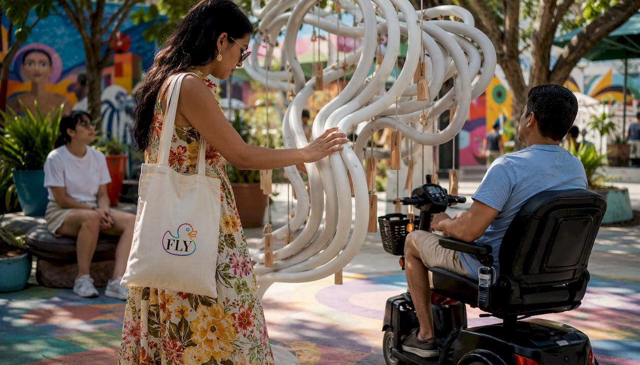
Physical interaction is the most accessible form of interactivity. Touchable sculptures, climbable structures, and pieces that respond to weight or movement give visitors a reason to engage their whole body. Research on tactile engagement shows that physical interaction reveals artistic knowledge that visual observation alone cannot provide. Visitors who touch sculptures shift from asking “what is this?” to “how was this made?” That shift in questioning is exactly what curators want.
Augmented reality adds a layer without replacing the physical object. Studies comparing AR approaches find that digitized AR sculptures anchored to physical artworks produce higher engagement and immersion than purely digital-native AR works. Visitors describe digitized AR as feeling “grounded,” while floating digital animations, however visually impressive, feel disconnected from the space. The practical takeaway: if you use AR, anchor it to something real.
Types of interactive elements worth considering:
- Touchable sculpture stations with varied textures, weights, and temperatures
- AR overlays triggered by a smartphone or tablet pointed at a physical piece
- VR alcoves for fully immersive narrative experiences tied to the exhibition theme
- Responsive installations that react to sound, movement, or proximity
- Co-creation zones where visitors arrange, build, or contribute to a collective work
Visitor satisfaction research is clear that meaningful interaction beats passive sensory immersion for overall satisfaction. A 360-degree projection room is impressive once. An installation that lets visitors choose their path, trigger information, or compare visual states keeps people engaged longer and generates stronger word-of-mouth.
Research callout: Interactive art democratizes galleries by enabling audience co-creation, breaking down the alienation that passive viewing often produces.
Keep interfaces low-friction. If a visitor needs more than ten seconds to understand how to interact with a piece, most will walk past it. Intuitive design, clear visual cues, and immediate feedback are not optional refinements. They are the difference between an interactive element that works and one that becomes an obstacle.
3. Educational and interpretive materials that actually inform visitors
Wall text is the most underestimated tool in exhibition design. Done well, it answers the question every visitor has but rarely asks aloud: “Why should I care about this?” Done poorly, it reads like a catalog entry and gets skipped entirely. The standard to aim for is a three-tier system: a headline that hooks (10 words or fewer), a short paragraph that gives context (50–75 words), and an optional deeper layer for visitors who want more.
Audio guides extend the interpretive layer without cluttering the visual space. The best audio content is written for the ear, not the eye. Short sentences, concrete images, and a conversational tone work far better than academic prose read aloud. Offering multiple tracks, one for general visitors, one for families, one for specialists, lets a single exhibition serve genuinely different audiences without compromising any of them.
Digital content opens additional possibilities. QR codes linked to artist interviews, process videos, or 3D model viewers give curious visitors a path deeper into the work without requiring staff time. The key is making the digital layer genuinely additive, not a substitute for strong physical interpretation.
Best practices for educational content design:
- Write wall text at an eighth-grade reading level, then test it on someone outside the art world
- Use active voice and concrete language (“Yebne carved this form over six months” beats “The form was created through an extended process”)
- Place interpretive text at eye level for standing adults and at a lower height for children and wheelchair users
- Offer large-print versions and audio descriptions as standard, not as afterthoughts
- Align every interpretive element with the exhibition’s central theme so content feels cohesive, not assembled from separate sources
- Include hands-on learning aids, material samples, or scale models where the work’s physical properties are central to understanding it
The goal of educational content is not to explain the artwork away. It is to give visitors enough context that they can form their own response. The best interpretive materials leave visitors with more questions than they arrived with, not fewer.
4. Curatorial and thematic cohesion for a compelling exhibition narrative
A strong curatorial theme is the spine of the entire exhibition. Without it, even technically excellent works feel like a group show rather than a statement. The theme does not need to be simple, but it does need to be communicable in a single sentence. If you cannot say what the exhibition is about in one sentence, visitors will not be able to either.
Thematic cohesion shows up in every decision: which works are included, in what order visitors encounter them, how the interpretive materials frame each piece, and even what music or soundscape accompanies the space. When these elements align, visitors experience the exhibition as a narrative arc rather than a collection of objects. When they conflict, even strong individual works feel out of place.
Aligning artworks with visitor flow is a curatorial skill that gets less attention than it deserves. The first piece a visitor sees sets expectations for everything that follows. Placing your most challenging or abstract work at the entrance risks losing visitors before they have built enough context to engage with it. A more effective structure often starts with an accessible, emotionally immediate work, builds complexity through the middle, and ends with something that reframes what came before.
Curatorial best practices for narrative cohesion:
- Write a curatorial statement before selecting works, not after, so the theme drives selection rather than justifying it retroactively
- Limit the number of works to what the theme genuinely requires; a tighter show is almost always stronger than a comprehensive one
- Use transitional spaces between gallery zones to signal shifts in theme or mood
- Brief visitors on the exhibition’s arc at the entrance, either through a short introductory panel or a map that shows the intended sequence
- Revisit the flow after installation and adjust placement based on how the works actually read in the space, not how they looked on the floor plan
Thematic cohesion also shapes the emotional impact of individual pieces. A sculpture that might read as playful in isolation can carry genuine weight when placed in a sequence that builds toward a larger idea. Curators who understand this use placement as an interpretive tool, not just a logistical one. For a practical look at how immersive pop art shows apply these principles, Flymiami’s curatorial approach offers a useful reference point.
5. What research says about visitor engagement in sculpture exhibitions
The research on visitor engagement in XR and interactive art exhibitions points consistently in one direction: functional satisfaction is the strongest predictor of whether visitors return. Functional satisfaction means the technology works smoothly, navigation is easy, and the physical experience is comfortable. Visitors who struggle with a clunky interface or an uncomfortable headset do not come back, regardless of how impressive the content was.
This finding has a direct implication for exhibition design. Investing in technical reliability is not a backstage concern. It is a front-of-house priority with measurable consequences for attendance. System fluency and physical comfort reduce visitor fatigue and improve the emotional impact of the exhibition as a whole.
Interactive installations also require ongoing technical maintenance. The Guggenheim’s conservation team has documented that interactive digital artworks require regular calibration to prevent glitches that break immersion. A sensor that misfires, a projection that stutters, or an AR marker that fails to track pulls visitors out of the experience immediately. Budget for a dedicated technical steward during exhibition hours, not just during setup.
Research callout: Interactivity emerged as the strongest dimension among all technological affordances in XR art exhibitions, outperforming immersion and presence in driving viewer satisfaction.
Social influence also shapes the exhibition experience more than most organizers expect. Visitors in open-ended, interpretive environments tend to look to others for cues about how to engage. Designing spaces that encourage social interaction, shared discovery, and visible co-participation amplifies engagement across the entire visitor group, not just among the most confident individuals.
Pro Tip: Test your interactive elements with visitors who have no prior art exhibition experience. If they can engage confidently within 30 seconds without staff assistance, the interface is working. If they hesitate or look for help, simplify the interaction before opening day.
6. Marketing and promotion strategies that actually fill your exhibition
The most thoughtfully designed exhibition fails without an audience. Marketing for sculpture exhibitions works best when it leads with the experience rather than the artwork. “Come see sculptures” is a weak hook. “Touch a bronze relief and discover what your eyes can’t tell you” gives a potential visitor a reason to show up.
Social media content that performs well for exhibitions tends to be process-driven. Behind-the-scenes installation footage, artist studio visits, and time-lapse videos of the space coming together generate genuine interest before opening day. Instagram and TikTok favor video, and sculpture, with its three-dimensionality and often dramatic scale, photographs and films better than almost any other art form.
Partnerships with local organizations extend reach without requiring large budgets. Schools, community centers, accessibility advocacy groups, and neighborhood associations all have audiences who may not self-identify as art visitors but respond to a personal invitation. Offering dedicated preview events for these groups builds goodwill and generates the kind of word-of-mouth that paid advertising rarely achieves.
Email remains the highest-converting channel for repeat visitors. A sequence that starts with a save-the-date, follows with a preview of what to expect, and closes with a last-chance reminder consistently outperforms single-blast announcements. Segment your list by past attendance behavior if possible: first-time visitors and returning visitors respond to different messages.
Press outreach should target both arts journalists and general lifestyle media. Local TV morning shows, city magazines, and food-and-culture blogs reach audiences who would never read an art review but will attend an exhibition that gets framed as an event worth experiencing. Pitch the sensory and interactive angle, not the curatorial one, for general media. For mixed-art live events that blend performance, sculpture, and community participation, the event framing tends to generate the strongest coverage.
7. How to measure visitor engagement and improve future exhibitions
Measuring engagement starts before the exhibition opens. Establish baseline metrics: expected attendance, target dwell time per gallery zone, and the specific interactive elements you want visitors to use. Without a baseline, post-exhibition data is just numbers without context.
Visitor surveys are the most direct feedback tool, but survey design matters enormously. Long surveys get abandoned. A five-question exit survey with one open-ended question (“What was the most memorable moment?”) yields more usable data than a twenty-question form. Digital kiosks at the exit, or a simple QR code linking to a mobile survey, increase completion rates compared to paper forms.
Behavioral observation is underused and often more revealing than surveys. Station a trained observer in each gallery zone for two-hour blocks at different times of day. Track which pieces draw crowds, which get bypassed, where visitors slow down, and where they speed up. This data tells you what is working spatially and interactively in ways that self-reported surveys cannot.
Digital tools add precision to behavioral data. Heatmapping software using anonymized Wi-Fi or Bluetooth signals can show visitor movement patterns across the entire space. Interactive installations with built-in analytics, tracking touch events, dwell time, and return visits, give curators granular data on which elements generate sustained engagement versus initial curiosity.
Post-exhibition review should be structured, not impressionistic. Bring together the curatorial, educational, and technical teams within two weeks of closing while details are fresh. Review the data against your baseline metrics, identify the two or three changes that would have the greatest impact on the next exhibition, and document them formally. Institutional memory in exhibition design is fragile. Written post-mortems are how organizations actually improve over time rather than repeating the same mistakes with different artworks.
Flymiami’s UV-reactive sculptures are built for exactly the kind of immersive, interactive exhibition environment this article describes. Pieces like the UV glow collection reveal hidden patterns and colors under blacklight, creating a built-in sensory reveal that gives visitors a reason to move through the space and return to pieces they have already seen. If you are building an exhibition that needs works capable of carrying an immersive lighting concept, explore the full sculpture collection to see what Flymiami’s handcrafted pop art pieces can bring to your next show.
Key Takeaways
An engaging sculpture exhibition requires lighting, interactivity, educational content, and thematic cohesion working together, with functional comfort as the strongest driver of repeat visits.
| Point | Details |
|---|---|
| Lighting shapes emotional impact | Directional light carves sculpture volume; color temperature sets the emotional register of each gallery zone. |
| Interactivity drives deeper connection | 85% of participants reported a deeper connection with artwork when interactive elements were present. |
| Functional comfort predicts return visits | Ease of navigation and physical comfort are the strongest predictors of visitor revisit intention, outweighing visual spectacle. |
| Educational content needs three tiers | A hook headline, a short context paragraph, and an optional deeper layer serve all visitor types without overwhelming any of them. |
| Thematic cohesion is a curatorial tool | Write your curatorial statement before selecting works so the theme drives every placement and interpretive decision. |
The case for designing exhibitions that demand participation
The conventional wisdom in exhibition design still tilts toward protection: protect the work, protect the visitor from confusion, protect the institution from liability. That instinct produces beautiful, inert spaces where people walk politely from label to label and leave having learned something but felt nothing.
The research points in a different direction. Visitors do not remember what they read. They remember what they did, what surprised them, and how their body felt in the space. An exhibition that lets someone climb a sculpture, trigger an AR layer, or rearrange elements of a co-creation zone gives them a story to tell. That story is the most effective marketing the institution will ever produce, and it costs nothing beyond the courage to design for participation rather than observation.
The technology argument is often overstated in the other direction, too. Curators who chase immersive spectacle, massive projection rooms, elaborate VR rigs, often discover that visitors are impressed for about four minutes and then done. The research is consistent: meaningful interaction beats passive sensory absorption every time. A simple touchable bronze relief that reveals something about process and material will generate more genuine engagement than a technically sophisticated installation that gives visitors nothing to do but watch.
The exhibitions worth attending in 2026 are the ones that treat visitors as participants in the work’s meaning, not as an audience for a finished statement. That shift in orientation, from display to dialogue, is what separates a memorable exhibition from a competent one. Flymiami’s approach to large-scale art installations reflects exactly this philosophy: works designed to be experienced in space, not just observed from a distance.