Common Home Ambiance Décor Mistakes and How to Fix Them
The most common home ambiance décor mistakes are poor lighting, wrong-scale furniture, undersized rugs, and mismatched finishes. Every single one is fixable, most without a contractor. Here are the top mistakes and their one-line fixes:
- Single overhead light only → Layer ambient, task, and accent sources; add dimmers.
- Wrong bulb color temperature → Use warm bulbs suitable for living spaces.
- Furniture too large or too small for the room → Ensure furniture size allows for comfortable circulation paths in the room.
- Undersized rug → At minimum, rest the front legs of all seating on the rug.
- Coffee table too far from the sofa → Keep it within a comfortable reach from the seat edge.
- Curtain rods hung too low → Mount rods 4–6 inches above the window frame and let panels touch the floor.
- Art hung too high → Center artwork 57–60 inches from the floor; leave 6–10 inches above furniture.
- Matchy furniture suite → Mix one modern anchor piece with varied eras; repeat one material for cohesion.
- No focal point → Designate one wall or object as the room’s visual anchor before adding anything else.
- Clutter without storage → Add a drop zone at the entry: bench, hooks, and a tray.
- Bare walls and floors → Layer throws, cushions, a rug, and curtains before buying more furniture.
- Outdated fixtures and hardware → Swap the overhead light and cabinet pulls first; they carry the most visual weight.
- Mirrors placed randomly → Hang mirrors opposite a window or light source to double the perceived brightness.
- Pattern overload → Limit active patterns to one per room; use solids and textures as the rest.
- Ignoring acoustics → Add a rug, curtains, and upholstered pieces to absorb sound in hard-surface rooms.
Table of Contents
- How do furniture scale and rug sizing affect the feel of a room?
- How does light change your paint color — and how do you test before committing?
- How do you style a room without making it look like a showroom?
- Why does a matching furniture set make a room feel flat?
- What curtain and rod mistakes are making your ceilings look lower?
- How do you hang art at the right height and plan a gallery wall?
- Which fixtures and hardware updates give you the most visual return?
- How do you add texture and curves to a room that feels cold?
- How do you display and care for statement or specialty artworks?
- Where should you place mirrors to improve space and light?
- How do you use patterns without creating visual clutter?
- How does the balance of warm and cool tones affect your room’s ambiance?
- Why do hard-surface rooms feel uncomfortable — and how do acoustics fix it?
- Key Takeaways
- The mistake most people make before they even start decorating
- A statement piece can solve more than one problem at once
- Useful sources
How do furniture scale and rug sizing affect the feel of a room?
Scale is the mistake most homeowners cannot name but everyone can feel. A sofa that fills 80% of a living room wall, or a dining table with chairs that scrape the baseboards when pulled out, creates physical tension. Rug sizing, lighting, and furniture scale are among the most common and fixable design mistakes in residential interiors.
How to measure before you buy:
- Measure the room’s full dimensions, then subtract 18–24 inches from each wall for breathing room.
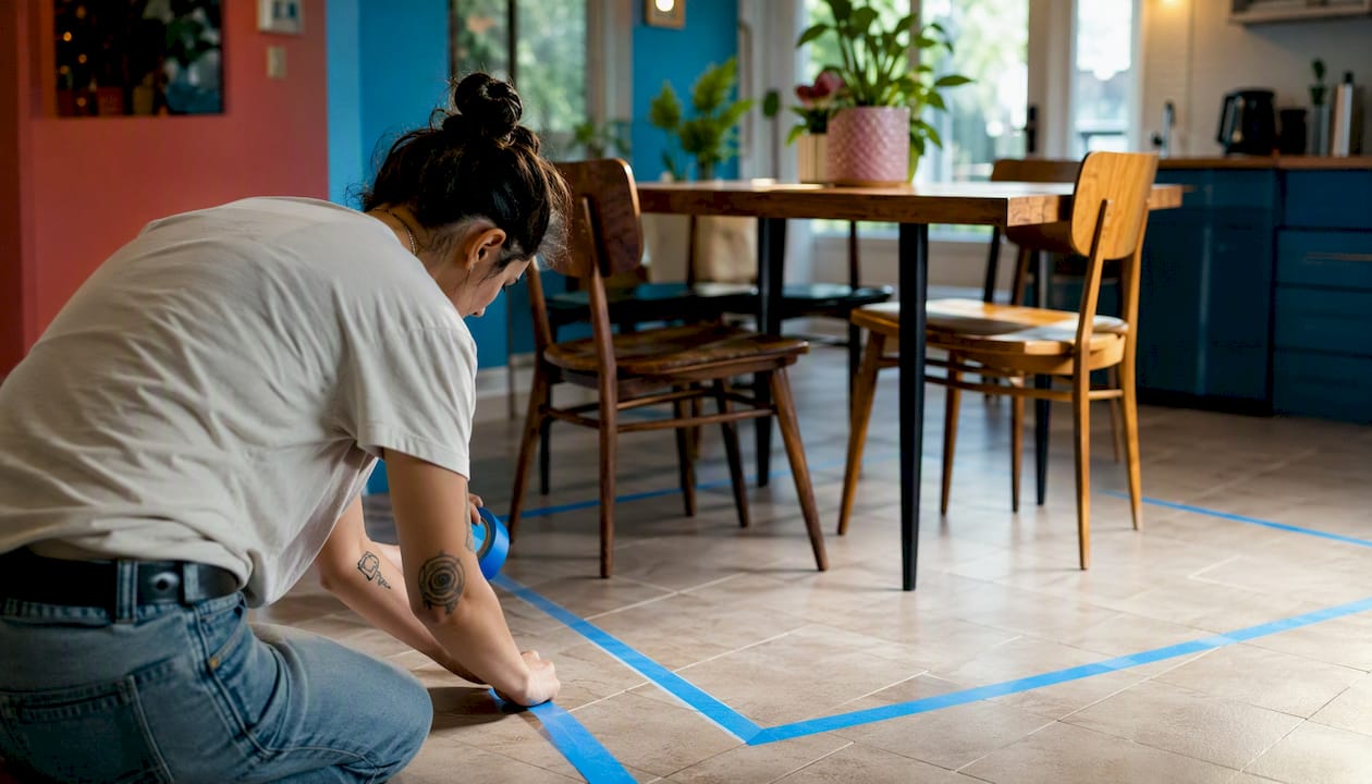
- Sketch the furniture footprint on graph paper or use painter’s tape on the floor to outline pieces before purchasing.
- Check circulation paths: 36 inches minimum for main walkways, 24 inches for secondary paths around furniture.
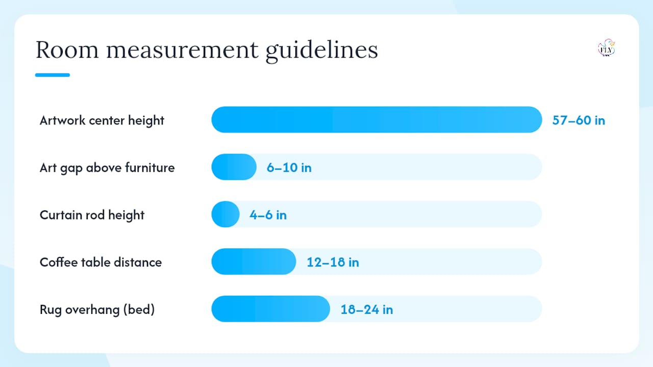
For rugs, the front-legs-on-rug rule is the baseline. In a living room, every sofa and chair should have its front two legs resting on the rug. A rug that sits only under the coffee table is too small. For dining rooms, the rug should extend at least 24 inches beyond the table on all sides so chairs stay on the rug when pulled out. In a bedroom, aim for 18–24 inches of rug overhang on each side of the bed.
The coffee table distance rule is simple: 12–18 inches between the table edge and the sofa seat. Closer than 12 inches and it feels cramped; farther than 18 inches and you cannot reach your drink without leaning.
For a deeper look at how furniture scale shapes a room’s proportions, the principles of visual weight and clearance apply whether you are working with a studio apartment or a large open-plan space.
| Element | Rule | Measurement |
|---|---|---|
| Artwork center height | From floor to center of piece | 57–60 inches |
| Art above furniture | Gap between top of furniture and frame | 6–10 inches |
| Curtain rod height | Above window frame | 4–6 inches |
| Rug overhang (bedroom) | Beyond bed on each side | 18–24 inches |
| Coffee table distance | From sofa seat edge | 12–18 inches |
| Bulb temperature (living areas) | Warm residential zones | 3000–3500K |
Pro Tip: Before drilling a single hole or buying a rug, tape out the furniture footprint on the floor with painter’s tape. It takes 20 minutes and saves hundreds of dollars in returns.
How does light change your paint color — and how do you test before committing?
Paint color is one of the most expensive home décor pitfalls to get wrong. A color that looks warm and earthy on a chip can read as muddy green on a north-facing wall, or as a completely different shade under incandescent versus LED light. The wall color you see in the store is not the wall color you will live with.
Here is a reliable testing protocol:
- Buy sample pots of your top two or three colors.
- Paint a 12-by-12-inch swatch directly on the wall, not on a piece of paper or card.
- Observe the swatch at three different times: morning natural light, midday, and evening under your artificial lights.
- Check it against the fabrics, rugs, and art you plan to use in the room.
- If two colors are close, paint them side by side on the same wall to compare under identical conditions.
North-facing rooms receive cool, indirect light all day, which intensifies blues and grays and can make warm tones look dull. South-facing rooms get strong, warm light that flatters almost any palette. East-facing rooms are warm in the morning and cool by afternoon. West-facing rooms do the opposite.
Pro Tip: Test paint in the corner of the room where two walls meet. That junction shows you how the color reads in shadow AND in direct light at the same time, which is more informative than a flat center swatch.
How do you style a room without making it look like a showroom?
Clutter and over-styling are opposite problems that damage ambiance in the same way: both make a room feel wrong to live in. Poor storage leads to visual noise; over-curation strips out personality. The goal is a room that looks considered but lived-in.
Declutter and storage checklist:
- Assign every object a home before it enters the room.
- Use built-in shelving, ottomans with storage, and console tables with drawers to keep surfaces clear.
- Apply the one-in-one-out rule: a new object replaces one that leaves.
- Style shelves with a mix of books, objects, and empty space. Empty space is not wasted space.
For vignettes (the styled groupings on a shelf, coffee table, or console), three rules hold up consistently: group in odd numbers, vary heights within the group, and anchor with one larger piece. A single tall vase, a medium stack of books, and one small object beats five objects of the same height every time.
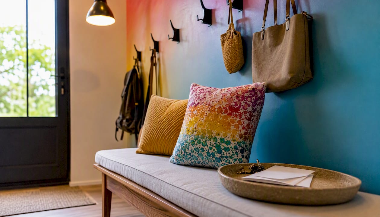
The entry is where most homes fail first. Designers consistently flag the missing drop zone as a top entryway mistake: no bench, no hooks, no tray. The fix takes one afternoon. A narrow bench, two wall hooks, and a small tray for keys and mail turns a chaotic entry into a functional first impression.
For rotating art and keeping styled spaces from going stale, practical guidance on refreshing pop art displays can help you rethink what stays on the wall and what gets swapped seasonally.
Numbered steps for a fast entry fix:
- Mount two to four hooks at 60–66 inches from the floor (reachable for adults, not a hazard for children).
- Place a narrow bench or shoe rack directly below.
- Add a small tray or bowl on the nearest flat surface for keys, mail, and cards.
- Add one mirror above the tray to check your appearance on the way out and to bounce light into the space.
Why does a matching furniture set make a room feel flat?
A matching furniture suite lacks character because it removes the visual tension that makes a room interesting. When every piece comes from the same collection, the eye has nowhere to travel. The room reads as a catalog page, not a home.
Mixing strategies that work:
- Keep one piece from the original set as an anchor, then introduce one item from a different era or material.
- Repeat one material (brass, linen, walnut) across different pieces to create cohesion without uniformity.
- Vary the scale: a low, wide sofa pairs well with a taller, slimmer armchair rather than a matching loveseat.
- Introduce one unexpected object, a vintage side table, a handmade ceramic lamp, a sculptural art piece, to break the catalog feel.
The same logic applies to accessories. A shelf lined with identical white vases reads as a store display. Swap one for a woven basket, one for a stack of books, and one for a piece with personal meaning.
Pro Tip: When mixing eras, let one material do the connecting work. Brass hardware on a mid-century credenza, a contemporary lamp, and a vintage mirror reads as intentional rather than random because the material repeats.
What curtain and rod mistakes are making your ceilings look lower?
Low-hung curtain rods are one of the most common interior design blunders, and one of the cheapest to fix. When a rod sits directly above the window frame, the eye reads the window as the ceiling height. The room feels shorter than it is.
The fix: hang rods 4–6 inches above the window frame, and in rooms with high ceilings, go higher, up to the crown molding. Let the curtain panels touch the floor. Not hover an inch above it. Touch it, or puddle slightly if the aesthetic calls for it.
Quick fixes for window treatments:
- Replace existing rods with longer ones that extend 6–12 inches beyond the window frame on each side to make the window appear wider.
- Swap grommet-top panels for back-tab or pinch-pleat headers, which hang more cleanly and read as more finished.
- If the curtains are too short, replace them. Hemming up is easy; adding length to a short panel is not worth the effort.
- Use a single color for curtains that is close to the wall color to maximize the height illusion.
A room with floor-to-ceiling curtains, even in a space with 8-foot ceilings, reads as taller and more considered than the same room with panels that stop at the sill.
How do you hang art at the right height and plan a gallery wall?
Artwork hung too high is the most common art mistake in residential interiors. The standard rule: center the piece 57–60 inches from the floor, which aligns with average eye level. When hanging above furniture, leave 6–10 inches between the top of the piece and the top of the furniture below it.
Step-by-step gallery wall planning:
- Choose a wall and measure its full width and height.
- Cut paper templates to match each frame’s dimensions.
- Arrange the templates on the floor first, experimenting with spacing and layout.
- Tape the templates to the wall with painter’s tape and live with the arrangement for a day.
- Mark nail positions through the templates, then remove the paper and hang.
| Gallery wall rule | Guidance |
|---|---|
| Center height | 57–60 inches from floor to center |
| Spacing between frames | 2–3 inches for a tight, cohesive look |
| Spacing above furniture | 6–10 inches between furniture top and lowest frame |
| Minimum gallery width | Match or exceed the width of the furniture below |
For mixed-media gallery walls, planning the layout with varied frame sizes and media types before committing to holes prevents the patchy, unresolved look that comes from adding pieces one at a time.
Which fixtures and hardware updates give you the most visual return?
Cheap or mismatched hardware is the detail that makes an otherwise well-designed room feel unfinished. A beautiful sofa in a room with a builder-grade ceiling fan and brass-and-chrome mixed pulls reads as incomplete. The hardware is the punctuation of a room.
Prioritize in this order:
- Overhead light fixture in the main living area or dining room. This is the most visible single object in the room and the one most likely to date a space.
- Cabinet pulls and handles in the kitchen and bathrooms. Swapping hardware is a one-hour DIY job that changes the perceived quality of the entire room.
- Switch plates and outlet covers. Mismatched or yellowed plates are invisible until you notice them, then you cannot stop seeing them.
- Faucets in bathrooms and the kitchen, if budget allows.
For finish cohesion, pick one metal family and use it across all hardware in a room. Matte black, brushed nickel, and unlacquered brass are all strong choices. Mixing two metals works only when one is dominant (80%) and the other is an accent (20%).
Budget guidance:
- DIY swaps (pulls, switch plates, light bulbs): under $100 per room.
- Midrange upgrades (new pendant, faucet): $150–$400 per item.
- Hire a licensed electrician for any hardwired fixture replacement if you are not comfortable with wiring.
How do you add texture and curves to a room that feels cold?
Hard surfaces without soft counterparts create two problems: the room looks cold, and it sounds bad. Underdressed sofas, bare windows, and lack of texture make a room feel unwelcoming. Hard floors, bare walls, and angular furniture with no upholstery also amplify sound, making conversations feel louder and less comfortable.
Layering checklist for texture:
- Add a rug to every hard-floor room, even a small one under the coffee table.
- Layer at least two throw pillows in different textures (linen, velvet, knit) on each sofa.
- Hang curtains even if you do not need privacy; fabric on a wall absorbs sound and adds softness.
- Introduce at least one woven element: a basket, a rattan tray, a macramé wall piece.
- Add one or two plants; organic shapes break the geometry of a room in a way no purchased object can replicate.
For curves specifically: a round mirror, a barrel chair, a curved sofa arm, or a circular coffee table each soften a room dominated by right angles. You do not need to replace all your furniture. One curved piece in a room of straight lines is enough to change the feeling.
Pro Tip: If a room echoes when you clap your hands, it needs more soft surfaces. A rug plus curtains plus upholstered seating will reduce that echo noticeably, and the room will feel warmer before you change a single paint color.
How do you display and care for statement or specialty artworks?
Statement art, including UV-reactive and sculptural pieces, requires more planning than a standard framed print. The placement decision should happen before the purchase, not after. A piece that is too large for its wall or positioned where it cannot be seen from the main seating area loses most of its impact.
Placement checklist:
- Stand at the room’s primary entry point and identify the first wall your eye lands on. That is your focal-point wall.
- Check sightlines from the main seating area: the art should be visible without turning your head more than 45 degrees.
- Scale the piece to the furniture below it: a large sculpture or canvas needs a substantial piece of furniture beneath it to anchor the composition.
- For sculptural art that anchors room design, consider depth as well as height and width when planning wall clearance.
For UV-reactive works specifically, the lighting setup is part of the artwork’s experience. A UV blacklight source positioned 3–6 feet from the piece activates the reactive pigments without washing out the visible-light colors. Accent lighting from a directional LED spotlight at a 30-degree angle from the ceiling works well for daytime display; the blacklight source can be on a separate switch for evening.
Care tips:
- Dust with a soft, dry microfiber cloth; avoid water or solvents on UV-reactive surfaces.
- Keep pieces away from direct sunlight, which degrades reactive pigments over time.
- For heavy sculptural works, use wall anchors rated for at least twice the piece’s weight.
- Review fine art care and longevity practices before mounting any high-value piece permanently.
Pro Tip: Plan the lighting before you buy the art, not after. A UV-reactive piece in a room with no blacklight source is just a painting. The right lighting setup is what makes it an experience.
Where should you place mirrors to improve space and light?
A mirror placed on a random wall does nothing. A mirror placed opposite a window doubles the natural light in the room and creates the illusion of a second opening. That is the entire principle of strategic mirror placement, and most homeowners skip it.
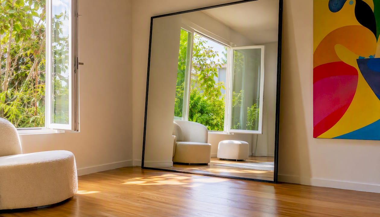
The rules are straightforward. Hang a mirror directly across from a window, a doorway, or a light source to reflect it back into the room. In a narrow hallway, a large mirror on the end wall extends the perceived depth. In a dark dining room, a mirror on the wall opposite the main light source makes the space feel twice as bright at dinner.
Avoid placing mirrors where they reflect clutter, a blank wall, or the back of a door. The mirror shows whatever is in front of it, so position it to reflect something worth seeing: a window, a plant, a piece of art, or an outdoor view.
Size matters here too. A small mirror on a large wall reads as an afterthought. A mirror that fills a significant portion of the wall reads as a design decision.
How do you use patterns without creating visual clutter?
Pattern overload is one of the subtler home décor pitfalls because it builds gradually. One patterned pillow is fine. Then a patterned rug. Then patterned curtains. Then a patterned throw. Suddenly the room has no place for the eye to rest.
The practical rule: one active pattern per room, supported by textures and solids. An “active” pattern is one with high contrast or a repeating geometric or floral motif. Textures (boucle, linen weave, herringbone in a single color) read as neutral and can layer freely.
When you want to use more than one pattern, scale contrast is what keeps them from fighting. A large-scale stripe and a small-scale geometric can coexist because the eye reads them as different visual weights. Two patterns at the same scale and contrast level will always compete.
Solids anchor a patterned room. If your rug is patterned, keep the sofa solid. If the curtains have a print, keep the pillows in textures and solids. The pattern gets to be the statement; everything else supports it.
How does the balance of warm and cool tones affect your room’s ambiance?
Warm tones (amber, terracotta, cream, warm wood) make a room feel intimate and grounded. Cool tones (gray, blue, white, chrome) make it feel open and calm. Neither is wrong. A room that mixes both without intention, though, feels unsettled.
The most common ambiance decorating error here is a warm paint color paired with cool-white LED bulbs, or a cool gray room with warm brass hardware and amber lampshades. The elements fight each other and the room never settles into a mood.
Pick a dominant temperature for the room and let the other appear as an accent. A warm living room can have one cool-toned piece of art or a single gray throw without losing its warmth. A cool, airy bedroom can have warm wood nightstands without feeling contradictory. The ratio matters: roughly 70% dominant tone, 30% accent.
Bulb temperature is part of this equation. A room decorated in warm tones lit with 5000K daylight bulbs will look wrong regardless of the paint color. Match the bulb temperature to the room’s intended mood: 2700–3000K for warm, intimate spaces; 3500–4000K for neutral or transitional rooms.
Why do hard-surface rooms feel uncomfortable — and how do acoustics fix it?
A room with hardwood floors, plaster walls, glass windows, and no soft furnishings is essentially a speaker cabinet. Sound bounces off every surface, conversations feel louder than they should, and the space never feels restful. Avoiding recessed-only lighting and layering fixtures at varying heights addresses the visual side of this; addressing the acoustic side requires soft surfaces.
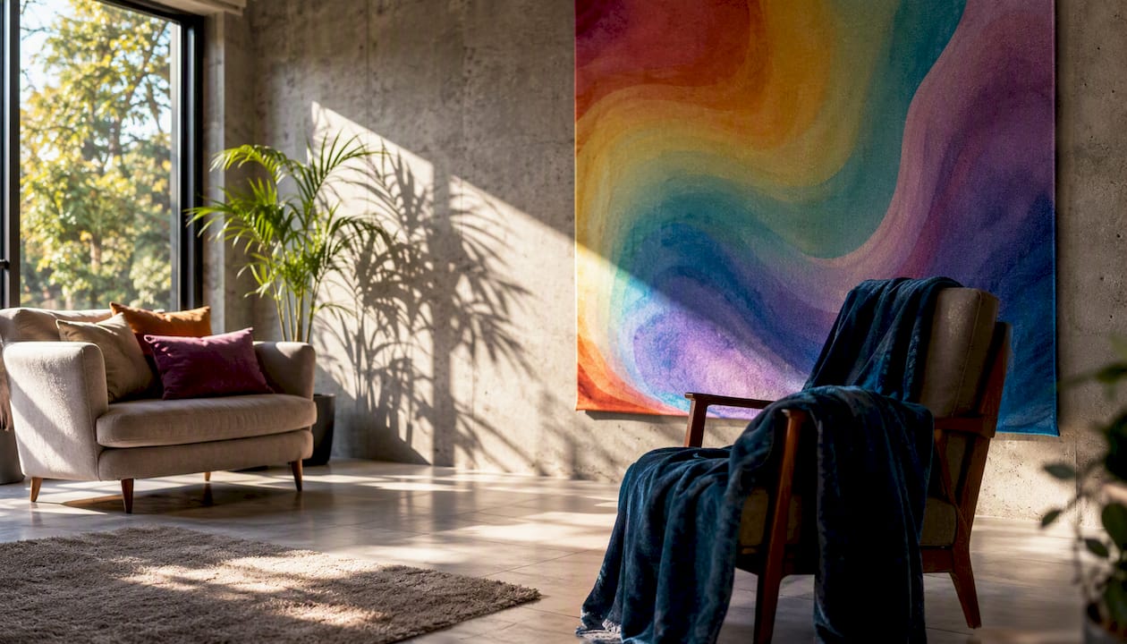
The fix is the same checklist that improves texture and warmth: a rug, curtains, upholstered seating, and wall textiles. Each material absorbs sound at different frequencies. A thick wool rug handles low-frequency rumble. Heavy curtains absorb mid-range frequencies. Cushions and upholstered chairs handle the high-frequency brightness that makes voices sound harsh.
You do not need acoustic panels or professional treatment. A well-furnished room with a rug, curtains, a sofa with cushions, and a few soft accessories will reduce echo noticeably. The room will feel quieter, warmer, and more comfortable to spend time in, even if nothing about the layout or color has changed.
Key Takeaways
The highest-impact fixes for home ambiance are lighting layers, correct scale, and art placement at the right height — all measurable, all achievable without a renovation.
| Point | Details |
|---|---|
| Layer your lighting first | Add ambient, task, and accent sources; use 3000–3500K bulbs and dimmers in living areas. |
| Follow the measurement rules | Art center at 57–60 in, curtain rods 4–6 in above the frame, front legs on the rug. |
| Fix scale before buying more | Use painter’s tape to map furniture before purchasing; keep coffee tables 12–18 in from the sofa. |
| Soft surfaces serve double duty | Rugs, curtains, and upholstered pieces improve both visual warmth and room acoustics. |
| Flymiami statement pieces resolve focal-point gaps | A well-scaled UV-reactive or sculptural work anchors a room and adds texture, light play, and personality in one object. |
The mistake most people make before they even start decorating
Most décor mistakes are not about taste. They are about sequence. People buy furniture before measuring, choose paint before testing it under their actual light sources, and hang art before deciding where the focal point is. The room ends up assembled rather than designed.
The planning-first approach is not complicated. Measure the room. Tape out the furniture on the floor. Test paint swatches at three times of day. Decide on the focal point before anything goes on the walls. These steps take a few hours total and prevent the expensive corrections that come later.
One rule worth keeping: if you cannot identify the focal point of a room within three seconds of walking in, the room does not have one yet. Everything else, the furniture arrangement, the art placement, the lighting plan, should build outward from that single anchor. A room without a focal point is a room that feels unresolved no matter how good the individual pieces are.
The other underestimated step is lighting. Most people plan lighting last, after the furniture is in place and the paint is dry. Lighting should be planned second, right after the focal point, because it determines how every other decision reads. A beautiful room under the wrong light is a room that does not feel beautiful.
A statement piece can solve more than one problem at once
When a room is missing a focal point, lacks texture, and feels flat, the instinct is to buy more things. More pillows, more accessories, more art. The better move is one well-chosen statement piece that does several jobs simultaneously.
A large-format wall art piece or a sculptural work anchors the focal point, introduces texture and dimension, and gives the room a reason to exist. Flymiami’s UV-reactive sculptures and statement pieces go further: under standard lighting they read as bold, handcrafted pop art; under blacklight they reveal hidden patterns and colors that transform the room’s atmosphere entirely. That dual experience is something no paint color or furniture arrangement can replicate.

Commissioning or selecting a piece starts with scale and sightlines, not style. Measure the wall, identify the primary viewing distance from the main seating area, and choose a piece sized to fill roughly two-thirds of the wall width above the anchor furniture. Flymiami works with private collectors, interior designers, and commercial clients on custom commissions sized and finished for specific spaces. Browse the UV glow art collection or reach out directly to discuss a commission scaled to your room.
Useful sources
- Designers share common home mistakes to avoid
- The most common decorating mistakes
- 7 surprising home décor mistakes—and how to fix them
- 6 Common Home Design Mistakes (and How to Fix Them)
- Decor mistakes that make a home feel unwelcoming
- 10 common decorating mistakes and how to fix them
- 11 interior design mistakes that are making your home look cheap
- Things I’d never buy for my home as an interior designer of 15+ years