Why Thematic Art Unifies Design Concepts in Any Project
Thematic art unifies design concepts by giving every visual choice a shared narrative purpose, so color, form, and repetition stop competing and start pointing in one direction. A recurring motif across a series tells the eye “this belongs together.” A controlled palette tells the brain “this mood is intentional.” Repeated formal language, the same line weight, the same scale rhythm, the same texture, tells a viewer they’re looking at one idea expressed many ways, not a pile of unrelated objects. Design theorists describe this as thematic design acting like conceptual glue, the invisible structure that lets a collection or a room read as a single statement rather than a scattered inventory.
Once a theme is locked in, it changes how you make decisions. You stop asking “does this piece look good?” and start asking “does this piece serve the story?” That shift is the whole game.
- A single recurring motif (a shape, a creature, a symbol) threading through a series signals intentional design, not coincidence.
- A restricted, repeated palette does more unifying work than matching subject matter ever could.
- Consistent formal language, line weight, texture, mark-making, keeps the eye moving comfortably between pieces instead of jarring at each transition.
Key Takeaways
Thematic art unifies design concepts by locking every formal choice, color, motif, material, and scale, to one shared narrative, which is why cohesive work reads as intentional rather than accidental.
| Point | Details |
|---|---|
| Theme is the glue | A shared narrative purpose ties color, motif, and form together so a project reads as one idea, not a pile of pieces. |
| Read formal signals first | Color, line, scale, and repetition reveal a theme faster than subject matter alone. |
| Use the 70/30 anchor rule | Devote most effort to reinforcing one anchor motif, then leave room for supporting variation. |
| Verify cultural context | Check symbol meanings against iconography sources before locking in a motif with cultural weight. |
| Flymiami as a working example | The studio’s UV-reactive duck motif shows a single anchor carried consistently across sculpture, wall art, and collectibles. |
Table of Contents
- Why Thematic Art Unifies Design Concepts Across Formal Choices
- The Role of Formal Elements in Carrying a Theme
- How Cultural and Historical Context Shapes What a Theme Says
- Practical Techniques to Apply a Theme Across a Project
- Common Pitfalls When Unifying Work With a Theme
- A Studio Case Study in Applied Thematic Design
- Thematic Unity Across Mediums, From Walls to Runways
- Why Unified Design Feels Different to the People Viewing It
- Evolving a Theme Without Losing It Across a Long Project
- What I’ve Learned Choosing the Anchor First
- Finding a Thematic Anchor Through FLY Miami Art
- Primary Sources and Further Reading
- Frequently Asked Questions
- Sources
Why Thematic Art Unifies Design Concepts Across Formal Choices
Unity doesn’t happen because pieces are pretty. It happens because someone made deliberate formal decisions and stuck with them. Identifying a theme in existing work, whether it’s a gallery show, a brand’s visual system, or your own body of work, starts with reading the same signals a designer used to build it.
1. Spot the motifs that keep showing up
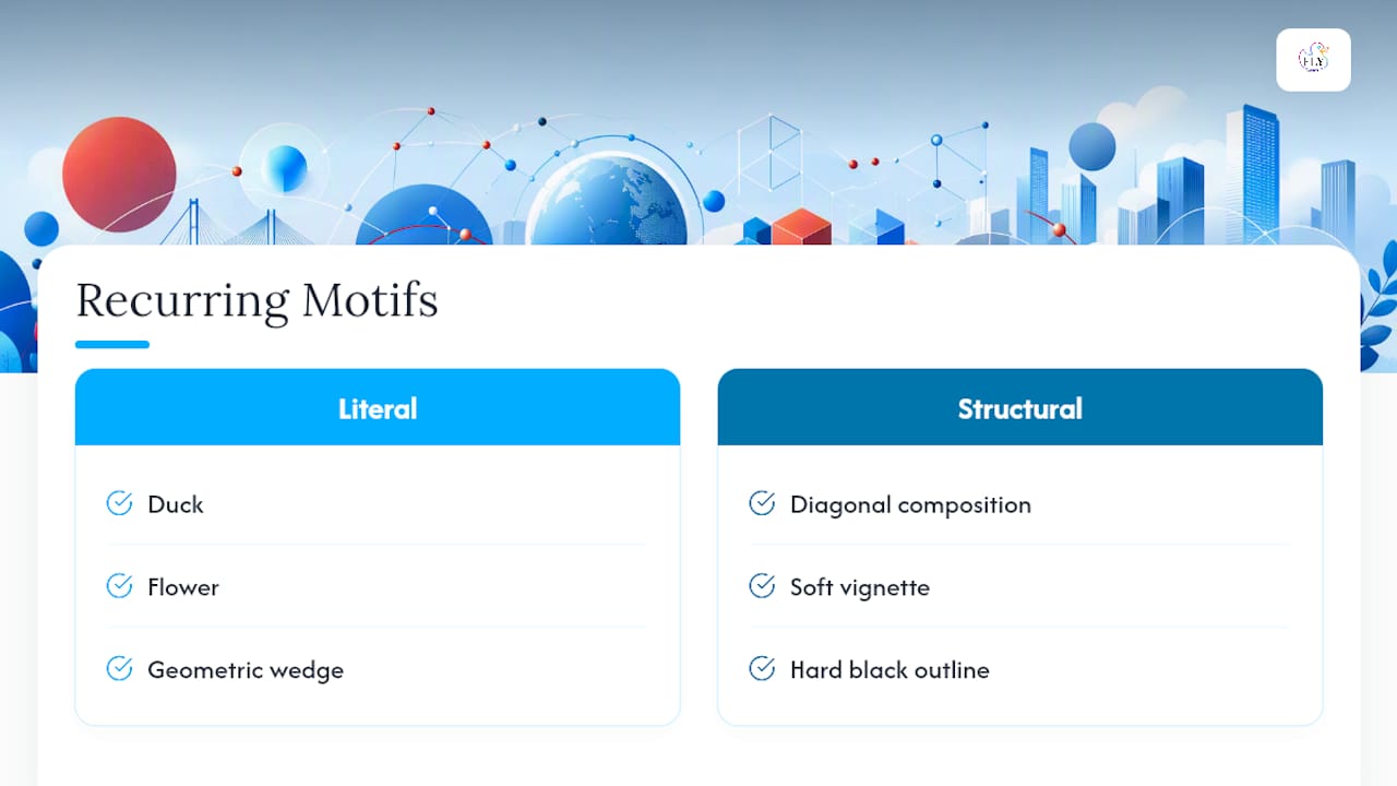
Look for the thing that repeats. It might be literal (a duck, a flower, a geometric wedge) or structural (a diagonal composition, a soft vignette, a hard black outline). If you see the same visual device in three or more pieces, that’s not accident. That’s a spine.
2. Read the formal signals before you read the subject matter
Color, line, texture, scale, and focal point carry more of the story than most viewers realize. A series painted entirely in desaturated blues communicates something different than the same subjects in high-chroma reds, even if the subject matter is identical. Formal elements and design principles like unity, variety, balance, and rhythm are the actual vocabulary artists use to build cohesion, and learning to read them is the fastest way to decode a theme without ever reading a wall label, a point well established in academic treatments of art, design, context, and meaning.
3. Use composition and hierarchy to find the narrative emphasis
Where does your eye land first? What’s largest, brightest, or most isolated in negative space? That hierarchy usually reveals what the artist or designer considers central to the theme, versus what’s supporting material. A show with one oversized “hero” piece and several smaller companions is telling you which idea is the anchor and which pieces are the chorus.
4. Cross-check against titles, statements, and provenance
Visual analysis gets you most of the way, but titles and artist statements confirm intent. If a series is titled around unity or peace and the palette is warm and the forms are rounded rather than jagged, the formal choices and the stated intent are reinforcing each other. When they contradict each other, that’s worth investigating rather than ignoring.
Pro Tip: Try reading a body of work twice: once purely as a gestalt, taking in the whole thing in one glance, and once piece by piece, formal element by formal element. The gap between your gut impression and your analytical breakdown usually points straight at the theme.
The Role of Formal Elements in Carrying a Theme
A theme isn’t a mood board pinned to a wall. It’s executed through specific, controllable elements, and each one does distinct work.
- Color palettes set the associative tone. Warm, saturated colors read as energetic and inviting; cool, muted tones read as contemplative or restrained. Restricting a palette to five or six colors across an entire project is one of the single fastest ways to make disparate pieces feel related.
- Repetition and rhythm build continuity. The same brushstroke, the same border treatment, the same proportion of positive to negative space, repeated across a series creates a visual heartbeat viewers register even when they can’t name it.
- Scale and contrast direct narrative emphasis. A larger piece surrounded by smaller, related works tells the viewer where the emotional weight of the theme sits.
- Material and typographic choices act as semantic signals. Rough, unfinished wood says something different than polished resin. A hand-lettered typeface says something different than a clean geometric sans. These aren’t neutral decisions.
Elements like line, shape, color, and texture, combined with principles like unity, variety, balance, and rhythm, form the working vocabulary designers use to build and audiences use to read cohesion, according to foundational design and meaning scholarship. Miss one of these levers and the theme gets muddy even if the subject matter stays consistent.
How Cultural and Historical Context Shapes What a Theme Says
A motif never means just one thing. A dove reads as peace in most Western contexts, but symbolic meaning shifts depending on who’s looking and what history they carry with them. Symbols function as a kind of code system, attaching cultural or emotional weight to simple, repeatable visual forms, which is exactly why the same shape can land completely differently for different audiences, a dynamic explored in research on symbolism and visual communication.
Historical references compound this. A rubber duck reads as playful nostalgia to most Western audiences today, but drop the same motif into a different visual tradition or historical moment and the connotation can shift entirely. Context doesn’t just add flavor. It can flip the message.
Before locking in a symbol as your unifying device, a few checks are worth the time:
- Verify culture-specific associations using iconography references rather than assumption; symbol lexicons and iconographic sources exist specifically to prevent this kind of misstep.
- Ask whether the historical period your motif references is one your audience will recognize, or one that needs framing.
- Check provenance on borrowed or referenced imagery, especially anything drawn from a cultural tradition outside your own.
- Add a caption or curatorial note when a symbol carries real risk of misreading; a sentence of context is cheaper than a misinterpretation.
Practical Techniques to Apply a Theme Across a Project
Reading a theme is one skill. Building one is another. These four steps form a repeatable workflow.
- Choose a thematic anchor and allocate roughly 70% of your effort to reinforcing it. Curators use this kind of anchoring constantly: a dominant motif or hero piece carries most of the visual weight, while the remaining 30% introduces variation that keeps the work from feeling monotonous. Practitioner guidance on thematic flow in curated spaces backs this ratio as a reliable starting point.
- Build a constrained palette and motif library, and write down the rules. Three to six colors, two or three recurring shapes or symbols, one consistent line quality. Document how each one gets used so collaborators or future-you stay consistent.
- Map sightlines and plan a rhythm of scale. Where will pieces be seen adjacent to each other? Large pieces should anchor visible corners or entry points; smaller supporting pieces fill the rhythm between them. This matters as much on a gallery wall as it does across a product line or a fashion collection.
- Produce a motif-application sheet. A one-page reference showing exactly how the palette, motif, and material choices apply across formats keeps execution consistent when a project stretches across weeks or multiple collaborators. Design education programs teach exactly this kind of documentation as standard practice, per Berkeley’s design research guidance.
| Method | Best for | Effort to maintain |
|---|---|---|
| Mood board | Early concept alignment | Low |
| Motif library with rules | Multi-piece or multi-collaborator projects | Medium |
| Sightline map | Physical spaces, exhibitions, installations | Medium |
| Motif-application sheet | Long-term or commissioned projects | Low once built |
Curators also use variety intentionally, working with something closer to a 60/30/10 split: core theme, related sub-themes, and a small wildcard allocation, which prevents even a tightly controlled thematic project from tipping into monotony.
Common Pitfalls When Unifying Work With a Theme
The most common failure isn’t a weak theme. It’s an overworked one.
- Thematic fatigue. Repeating the same motif without variation reads as repetitive rather than intentional. Reserve roughly 10% of a collection as a genuine wildcard piece to keep the eye engaged.
- Inconsistent materials or finishes. A matte piece next to a glossy one, or raw canvas next to heavily varnished work, breaks cohesion even when the subject matter matches perfectly.
- Cultural blind spots. Borrowing a symbol without checking its associations risks confusing or alienating the audience the theme was supposed to unite.
- Skipping the audit. Before finalizing a collection or layout, walk the full sequence and ask: does every piece serve the anchor, or is something in here for its own sake? Curators planning immersive shows run into this constantly, and a curator’s guide to common gallery mistakes catalogs the recurring ones.
Pro Tip: Lay every piece out physically, or in thumbnail form, before you finalize anything. Problems that are invisible one piece at a time become obvious the second you see the whole sequence together.
A Studio Case Study in Applied Thematic Design
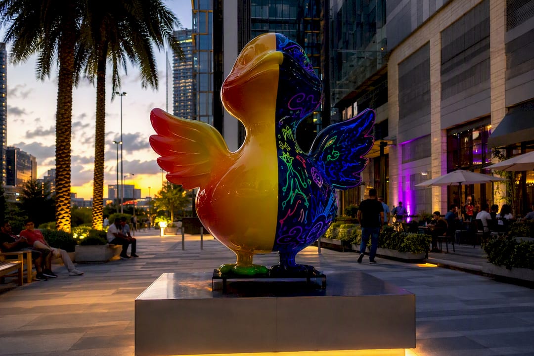
FLY Miami Art built an entire series around a single recurring motif: a stylized duck rendered in UV-reactive paint that shifts appearance completely under blacklight. The motif recurs across sculptures, wall pieces, and collectible objects, but the material choice does as much unifying work as the shape itself.
Under ordinary light, the duck reads as playful pop art. Under blacklight, hidden patterns and secondary colors emerge that aren’t visible at all in daylight, so the same object tells two different stories depending on how it’s viewed.
That dual-state approach isn’t decoration. It’s the thematic anchor. Every piece in the series uses the same UV-reactive material logic and the same rounded, high-chroma visual language, so a collector who owns three pieces from different points in the series still experiences them as one coherent body of work rather than three unrelated purchases.
- The motif (the duck) repeats across mediums: sculpture, wall art, and collectible objects.
- Material and lighting decisions, specifically blacklight-reactive paint, reinforce the theme rather than sitting on top of it decoratively.
- Collectors and gallery visitors consistently respond to the “reveal” moment when blacklight exposes the hidden layer, a reaction that curatorial research links to stronger emotional engagement in consistently themed environments, per thematic flow research.
Readers curious about the fabrication side can review the studio’s process directly through its studio process page, or explore related craftsmanship notes in a guide to mixed media pop sculpture.
Thematic Unity Across Mediums, From Walls to Runways
The mechanism doesn’t change from medium to medium, only the materials do. Interior designers use a dominant color story and repeated material texture (wood grain, brass fixtures, a specific fabric weave) to make a room feel composed rather than accidental. Graphic designers do the same thing with a locked type system, a restricted color palette, and consistent iconography across a brand’s touchpoints, so a business card and a billboard clearly belong to the same entity.
Fashion collections lean on it hardest of all. A single silhouette, fabric treatment, or color story repeated across a runway show is what separates a “collection” from a rack of unrelated garments. Escape room and experiential design operate on an almost identical logic: themed environments use consistent sensory cues, color, sound, texture, to keep guests immersed in one narrative world rather than jolted between disconnected rooms, a principle laid out clearly in experience design research on themed spaces.
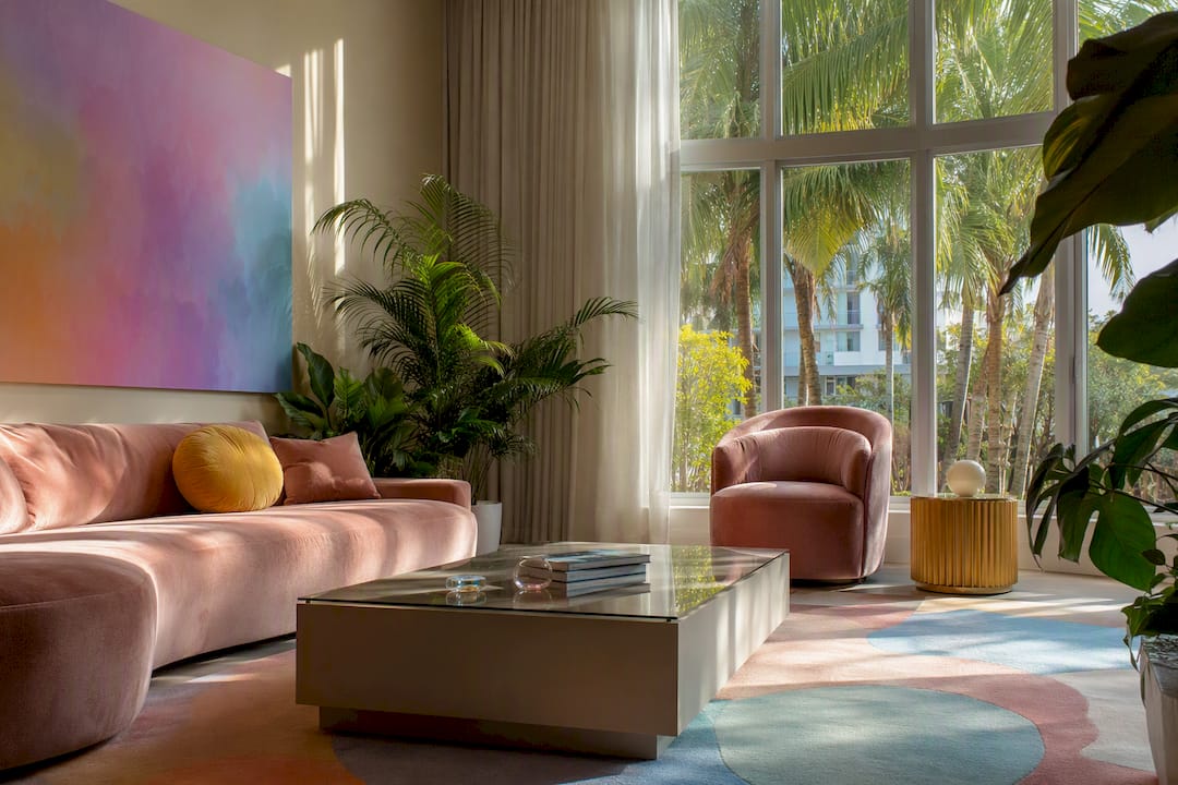
What ties all four mediums together is restraint. The strongest thematic work in interiors, graphics, fashion, and immersive spaces shares one trait: a small set of controlled variables, color, motif, material, repeated with discipline rather than a large set of ideas competing for attention.
Why Unified Design Feels Different to the People Viewing It
Cohesive, thematically unified work doesn’t just look more polished. It changes how people process what they’re seeing. When every element in a space or series reinforces the same visual logic, viewers spend less mental energy figuring out how the pieces relate and more energy actually engaging with the content.
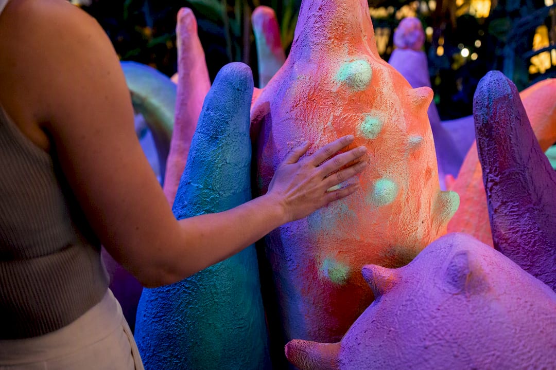
Applied curatorial research links consistently themed environments to improved mood and reduced cognitive fatigue in viewers, compared to visually fragmented spaces where the eye has to constantly reorient, a finding drawn from research on curated thematic flow. That’s not a minor aesthetic bonus. It’s the difference between a room that feels calming to sit in and one that feels subtly exhausting, even when a viewer can’t articulate why.
There’s also a trust signal baked into visual coherence. A unified body of work reads as intentional, and intentionality reads as expertise. A scattered collection, even one made of individually strong pieces, tends to read as unfinished or uncertain. Viewers pick up on that distinction fast, often within seconds of walking into a room or scrolling past a portfolio.
Evolving a Theme Without Losing It Across a Long Project
Long-term projects, a multi-year exhibition series, an ongoing brand identity, a body of work built over several collections, run into a specific problem: the theme that felt fresh at the start can calcify into a formula if it never moves.
The fix isn’t abandoning the anchor. It’s evolving it deliberately. Keep the core motif and the underlying formal logic (the same restricted palette family, the same material language) while allowing secondary elements to shift: a new scale, a new supporting color, a new context for the same symbol. Think of the anchor as a root system rather than a fixed template.
A practical way to manage this: revisit your original motif-application sheet at each major project milestone and ask what’s still serving the theme and what’s become rote repetition. If a formal choice was made because it worked, not because the rules demanded it, it earns a place in the next phase. If it’s just there out of habit, that’s where evolution should happen first.
What I’ve Learned Choosing the Anchor First
The projects that fall apart are almost never the ones with a weak concept. They’re the ones where the anchor got chosen last, after half the pieces were already made, which forces every subsequent decision to retrofit a theme onto work that was never built to carry one.
Pick the motif, the palette, and the material logic before the first piece exists. Everything downstream gets faster and more consistent once that anchor is locked.
Pro Tip: Write your thematic rules down in one paragraph before you start production. If you can’t explain the theme in three sentences, it’s not ready to guide a whole project yet.
Readers building out a full series or exhibition can find more process detail in the studio’s notes on curating immersive shows.
Finding a Thematic Anchor Through FLY Miami Art
A strong theme needs a strong anchor, and sometimes the fastest way to get one is to start with a piece built to carry that weight already. Flymiami’s collections give collectors and designers exactly that kind of starting point instead of forcing you to build a visual language from nothing.
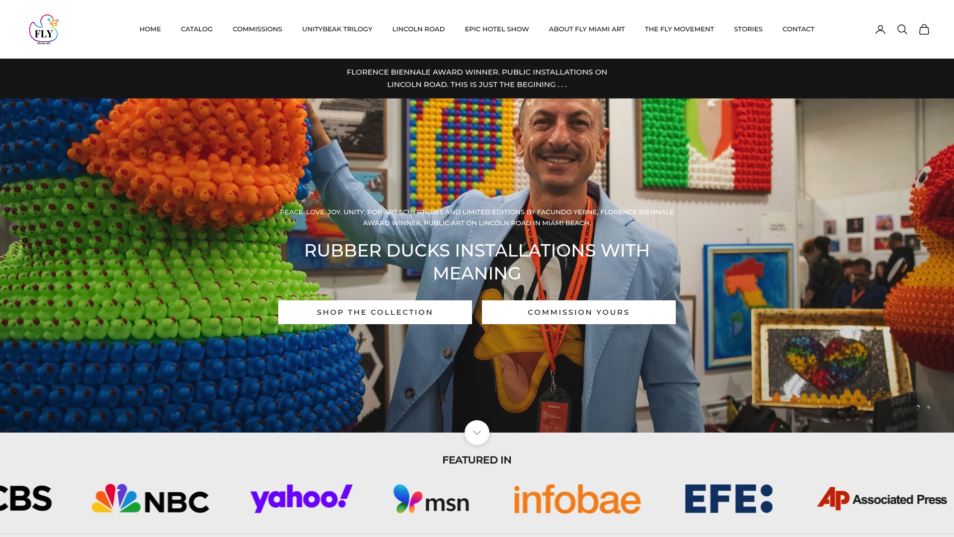
The wall art collection works well as a foundational anchor for interiors that need one dominant visual story to build a room around. For projects needing a hero piece with real physical presence, the sculpture collection offers limited-edition pieces sized for exactly the kind of sightline planning covered earlier in this guide. And for anyone drawn to the dual-state material approach discussed in the case study, the UV glow art collection demonstrates how a single lighting decision can carry an entire thematic identity across a series.
Custom commissions are also available for collectors, designers, and institutions who need a piece built specifically around an existing thematic system, whether that’s a hotel lobby, a private collection, or a public installation. If a project needs one anchor piece that ties the rest of a space together, request a commission consultation through Flymiami’s collections and start the conversation from there.
Primary Sources and Further Reading
For readers who want to go deeper into the formal analysis and curatorial reasoning behind this guide, a few sources stand out. The StudySmarter explainer on thematic design covers the core mechanics of thematic cohesion in plain terms, while the Manifold academic text on design and meaning offers a more rigorous breakdown of elements and principles. For symbol verification, Wikipedia’s iconography overview is a solid starting point before committing to culturally loaded imagery in any project.
Frequently Asked Questions
What is thematic design, exactly? Thematic design is the practice of organizing visual elements, color, motif, material, composition, around one shared narrative or concept so a project reads as a single cohesive statement rather than a collection of unrelated choices.
How is thematic art different from just having a consistent style? Style is a visual signature; theme is a conceptual one. You can have consistent brushwork or color grading without a unifying idea behind it. A true theme means every formal choice is serving a specific narrative or message, not just a recognizable hand.
Can a theme evolve without breaking unity? Yes, and it usually should on longer projects. Keep the core motif and material logic intact while letting secondary elements, scale, supporting colors, context, shift over time. The anchor stays fixed even as the details around it move.
What’s the biggest mistake artists make when trying to unify a body of work? Choosing the anchor too late. Retrofitting a theme onto work that already exists is far harder than designing every piece around a motif and palette decided in advance.
How much variation can a themed collection have before it stops feeling unified? There’s no fixed number, but curatorial practice often points to something like a 60/30/10 or 70/30 split: most of the work reinforcing the core theme, with a smaller share for wildcard or exploratory pieces that keep the series from feeling repetitive.
Sources
- Thematic Design: Meaning & Importance | StudySmarter
- Introduction to art, design, context, and meaning — Manifold
- Conference paper on symbolism and art communication (IWACLE 2018)