Pop Art Motifs: Symbols, Colors and What They Mean
Pop art motifs are the everyday images the movement borrowed and made into fine art: consumer goods, comic strips, celebrity faces, advertising, flags and food. They arrived with a set of techniques, such as flat color, repetition and dots, that became motifs of their own. Below you will find the main motifs, what they were meant to say, how rainbow and multicolor palettes fit in, and how artists carry these symbols into homes, galleries and public spaces today.
TL;DR
- Pop art’s core motifs come from mass culture: advertising, comics, movies, packaged goods and celebrity.
- Techniques like Ben-Day dots, silkscreen and repetition are part of the message, not just style. They imitate industrial printing.
- Most symbols carry irony, critique or fascination with consumer life, and the meaning shifts with the artist and the decade.
- The rainbow and multicolor palettes link pop’s bold color to solidarity, inclusion and Pride.
- For a home, hotel or public site, choose one strong motif and match it to scale, safety and context.
Table of Contents
- The core motifs of pop art
- Techniques that became motifs
- What pop art symbols mean
- Rainbow and multicolor pop art
- Pop art vs modern art and contemporary art
- Pop motifs today: decor and immersive installations
- Our perspective: where UV light adds a layer
- Choosing motifs for a space or public installation
- Bring a motif home
- FAQ
- Sources
The core motifs of pop art
Pop art emerged in Britain and America in the mid- to late-1950s, mirroring, critiquing and sometimes incorporating everyday items, consumer goods and mass media imagery. The motifs follow from that idea. If it was on a shelf, a screen or a billboard, it was fair game.
Consumer goods and food. Soup cans, comic strips and hamburgers were lifted to the status of fine art. The point was the shift in setting: an object you walk past in a supermarket suddenly hangs in a gallery. The 1964 American Supermarket show pushed this literally, placing art next to plastic and real food so viewers could compare the products with the artists’ versions of them.
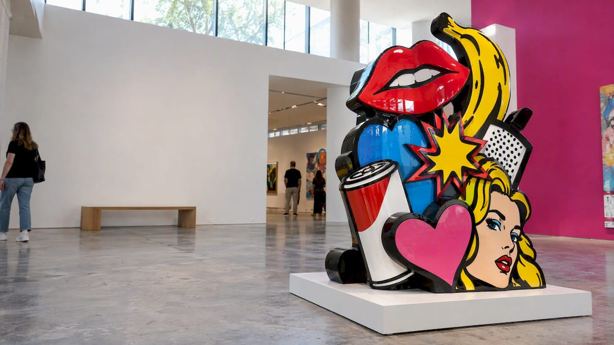
Comics and advertising. Artists used found imagery from advertising, music, film, magazines, comics and newspapers to parody, reflect and comment on society. Speech bubbles, bold outlines and slogan-like text all belong here.
Celebrity and glamour. Faces from Hollywood and the news became repeated icons. Warhol’s Gold Marilyn Monroe evokes religious icons and calls attention to the artifice of glamour, turning a starlet into something closer to a Byzantine Madonna.
National symbols and plain signs. Jasper Johns painted flags and targets, and Robert Rauschenberg attached found objects to painted canvases, according to a teaching guide on American pop art. These are motifs so familiar that viewers stop seeing them, which is exactly why they work.
Domestic life. Pop also played with elements and imagery of domestic life, consumerism and popular culture, and that is why wallpaper, furniture and homewares are such natural pop surfaces.
The body and politics. In the 1960s and 70s, artists questioned depictions of the female body in art and popular culture. Outside the US and UK, Global Pop used commercial imagery for political opposition, satire and anti-imperialist critique.
Why America, and why then? Postwar prosperity, mass production and nationwide distribution of goods, helped along by the interstate highway system, put the same products in stores across the country. For more on that link between shopping culture and subject matter, see our piece on how mass culture shaped pop art’s themes and methods.
Techniques that became motifs
In pop art, how an image is made is often as recognizable as what it shows. Three techniques do most of the work.
Ben-Day dots and silkscreen
Ben-Day dots and silkscreening imitated industrial printing. The dots read instantly as “comic book” or “newspaper”, even when the subject is a portrait or a landscape. Silkscreen let artists use commercial advertising methods and downplay the artist’s hand, which challenged the idea of originality and preciousness.

Repetition and multiples
Repeating formats such as multiples, diptychs and mirror images reflect Pop artists’ interest in the mass production of homewares, cars, gadgets, fashion and music. A grid of the same face is a visual statement about the assembly line.
Flat, bright, artificial color
Pop artists strove for straightforwardness, using bold swaths of primary colors. Global Pop pushed this further with flattened imagery and bright artificial colors, while inflatables and soft sculptures carried human associations tinged with a sense of the unnatural. That last point matters for sculpture: a glossy, inflated or molded object can feel both friendly and a little strange.
What pop art symbols mean
Pop symbols rarely have one fixed meaning. Three readings come up again and again.
- Celebration. The artist loves the glow of the product, the star or the logo, and invites you to enjoy it.
- Critique. Repetition and flatness expose how packaged and manufactured desire can be. The Marilyn example above is both a tribute and a comment on glamour.
- Elevation. Moving imagery from advertising, music and film to gallery walls elevated everyday material to the status of fine art, which asks who decides what counts as art.
Irony and wit were part of the toolkit from the start. A soup can can be a joke, a portrait and a question at once. When you look at a pop piece, ask three things: what is the original source of this image, what has the artist changed (color, scale, repetition), and what feeling does that change create? That quickly separates a genuine pop idea from a pop-looking decoration. Our guide to pop art cultural commentary pieces walks through that kind of reading for collectors.
Rainbow and multicolor pop art
A rainbow is not a classic 1960s pop subject, but it sits comfortably inside pop’s logic: a universally recognized symbol, built on flat, saturated color and easy to repeat. Rainbow themed art and multicolor pop art draw on both traditions at once.
Why the rainbow works as a symbol
Rainbows’ rows of color make them suited to solidarity and inclusion, and the rainbow is strongly associated with the LGBTQ movement, as PBS SoCal’s Artbound explains. The same article notes that Dan Flavin used fluorescent light tubes and Andy Warhol made related Marilyn Monroe images in a spectrum of colors. In other words, serial images in different colors and light-based color were already rainbow thinking.
The Pride flag as a pop object
Gilbert Baker’s Rainbow Flag was first unfurled at San Francisco’s Gay and Lesbian Freedom Day Parade on June 25, 1978, and MoMA records that its multicolor design symbolizes pride, acceptance, community, diversity and love. It is a handmade object that became a mass symbol, which is very close to what pop art does with its own imagery.
Using multicolor without it turning to noise
- Anchor the palette. Let one or two hues lead and the rest support, or the piece reads as clutter.
- Keep shapes simple. Flat, clearly outlined forms, a pop habit, let a bright palette stay legible.
- Use repetition on purpose. The same form in a spectrum of colors is a pop device with a long history.
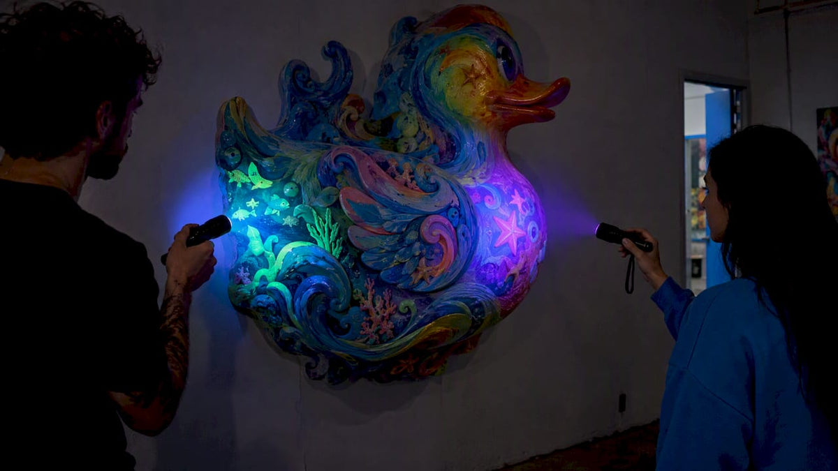
- Think about light. Fluorescent and UV-reactive materials add a second layer: the piece looks one way in daylight and another under blacklight.
On color psychology, the honest answer is that pop art uses color for impact and recognition more than for a fixed emotional code. Primary colors read as direct and commercial, and artificial brights read as manufactured. Rainbow palettes carry the inclusion meaning described above. Beyond that, the effect depends on the viewer and the setting.
Pop art vs modern art and contemporary art
Searchers often ask how pop art differs from modern art. The cleanest contrast is with the movement it reacted against. Pop favored realism, everyday imagery and commercial methods, in contrast to the highly expressive, large-scale abstract paintings of the Abstract Expressionists. Put simply, pop favored clearly rendered, recognizable imagery, where the abstract painters offered personal gesture.
Pop images often resembled commercial labels produced by an assembly line rather than the surface flourish of paint laid on by the modern artist’s hand. The same source notes that pop looked lighthearted and emphatically American, and to some viewers uncomfortably closer to mass culture than to modern art.
Two clarifications help:
- Modern art is a broad period label covering many movements, and pop art is one of them.
- Contemporary art is the art of our own time. Pop art is a historical movement, while contemporary artists often borrow its motifs, which is why you will see pop-influenced work in current galleries. Our piece on why pop art remains culturally relevant covers that afterlife, and pop art vs street art covers a neighboring comparison.
Pop motifs today: decor and immersive installations
Contemporary artists have taken pop’s borrowed imagery off the wall and into whole rooms. MOCAD describes Martha Mysko’s installations as combinations of painting, sculpture, photography, architecture, thrifted furniture, textiles and digital imagery that evoke malls, sitcom sets and suburban interiors. Salone del Mobile describes Alex Da Corte’s approach as turning media and consumer imagery into immersive environments, coordinating vivid wallpaper, furniture, objects, patterns and fluorescent video palettes.
The same instinct shows up in fan conventions and branded spaces, where entertainment imagery is staged for crowds. If you are curious how that world is run, this case study on live entertainment event production shows one example.
For a private space, the lesson is restraint. Our guide to pop art interior design argues for one hero piece rather than a room full of pop references, and pop art movements worth collecting helps you decide which strand fits your taste.
Our perspective: where UV light adds a layer
We make sculpture, so we think about motifs a little differently. A painting or a print presents its symbol once. A sculpture is seen from all sides, in changing light, and that gives us room to let a motif unfold.

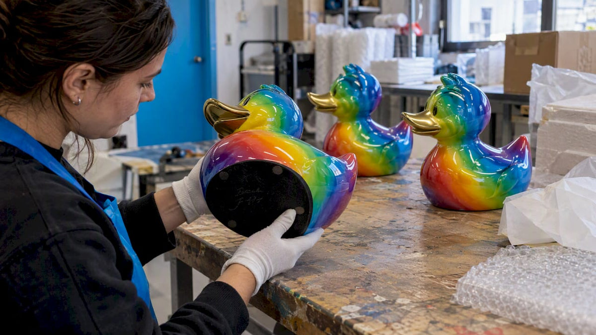
Our rubber duck pieces are a good example. The duck is a pure pop object: cheap, familiar, mass produced and instantly friendly. We take that mass-market toy and make the opposite of mass production: every piece is handmade and original. We add UV-reactive pigments so hidden patterns and colors appear under blacklight. In daylight you see one piece, and in the dark another. We see it as a natural extension of pop’s old trick of showing you something familiar in a way you did not expect, which we explore in why UV innovation updates pop art’s mass-media tradition.
The themes we return to are peace and unity, and the rainbow is a natural language for that. That is why Pride imagery is a regular part of our work. A motif should mean something to the person living with it, and a rainbow that says “everyone belongs” does that for many of our collectors.
— Facundo
Choosing motifs for a space or public installation
A motif that works on a living room wall can fail on a plaza or in a hotel lobby. For public projects, planners are told to assess technical feasibility, relevance to the site and host community, outdoor suitability, maintenance, scale, visibility and accessibility. Placement should not block windows or entrances or obstruct pedestrian circulation.
City programs add more. The City of San Diego’s civic-art criteria include public safety, acquisition and operating cost, ADA accessibility, provenance and copyright, legal and ethical issues, site context, timing and community feedback. Treat that list as a useful checklist wherever you are.
A practical way to apply it to motifs:
- Name the audience. Families, hotel guests and passers-by read a rubber duck, a flag or a celebrity face very differently.
- Check rights. Borrowing a famous face or logo raises copyright questions, so original imagery is safer for commercial and public work.
- Test the scale. Flat graphic motifs hold up from a distance, and fine pattern detail needs a close viewing spot.
- Plan the light. If a piece uses UV-reactive materials, decide where blacklight will be and how the piece looks without it.
- Think maintenance. Outdoor pieces need materials and finishes that suit the site.
Our pop art studio guide for collectors, hotels and galleries covers how the process works when a piece is made for a particular space.
Bring a motif home
If you want pop motifs with a glow, start with our UV/Glow Art collection, or browse sculpture, wall art and originals. Rainbow and Pride themes live in the Pride Collection. If you have a specific space, brand or public site in mind, you can ask about a commission or a custom glow piece. Our Pop Culture series reimagines familiar icons for collectors who prefer the classic pop route.
FAQ
What are common themes in pop art?
Consumerism and mass media, often shown through everyday imagery, irony and wit. Artists drew on advertising, comics, film and celebrity, then repeated or simplified it. Some also took on politics and the depiction of the body.
What are the most common pop art symbols?
Soup cans, comic panels, hamburgers, flags, targets, celebrity portraits and branded products come up most often. Dots, repetition and flat bright color work as symbols too. Their meaning varies from celebration to critique depending on the artist.
Is rainbow art part of pop art?
Not in the original 1960s canon, but it fits pop’s bold color and serial imagery closely. Artists like Warhol worked in spectrums of color, and the rainbow has since become a major symbol of Pride and inclusion. Many contemporary pieces combine the two.
How is pop art different from modern art?
Modern art is a wide period covering many movements, and pop is one of them. Pop pushed back against the expressive abstraction before it, using recognizable commercial imagery and printing methods instead of the artist’s visible brushwork.
Sources
- What is Pop art? | MoMA
- Smarthistory: Pop art, an introduction
- Think You Know Pop Art? | Tate
- Political Pop: An Introduction | Tate
- Pop Art in the US | DPLA
- Pop Art & '60s Vibes | Cooper Hewitt
- Lesson Three: Transforming Everyday Objects | MoMA
- The Power of a Rainbow | PBS SoCal Artbound
- Gilbert Baker, Rainbow Flag, 1978 | MoMA
- Encyclopedia of American Studies
- Martha Mysko: Retail Therapy | MOCAD
- The total work of art according to Alex Da Corte | Salone del Mobile
- Design and Review Criteria for Public Art | PPS
- City of San Diego civic-art criteria